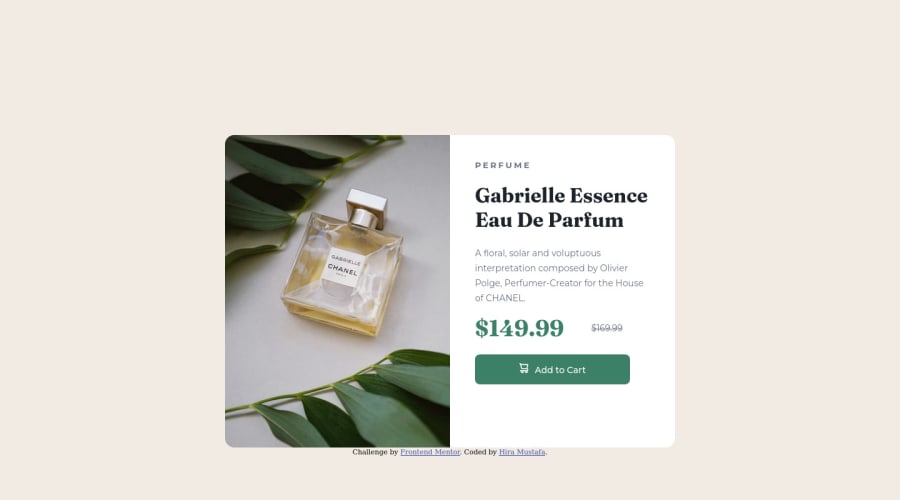
Design comparison
Solution retrospective
Hello everyone,
This is my first attempt. Suggestions for improvements will be highly appreciated. And yes I want guidance with media queries. I struggled a lot while making it responsive.
Thanks and looking forward to your feedback.
Regards, Hira Mustafa
Community feedback
- @VCaramesPosted almost 2 years ago
Hey there! 👋 Here are some suggestions to help improve your code:
Congrats on your completing your first challenge!
- Since the images in this component add value and serve a purpose (displaying the product), it is best to use the
Picture
element and not thebackground-image
property, as it will to use different images during different breakpoints.
Here is an example of how it works: EXAMPLE
Syntax:
<picture> <source media="(min-width: )" srcset=""> <img src="" alt=""> </picture>
More Info:
https://www.w3schools.com/html/html_images_picture.asp
https://web.dev/learn/design/picture-element/
-
The only heading in this component, is the name of the perfume; “Gabrielle Essence Eau De Parfum” . The rest of the text should be wrapped in a
Paragraph
element. -
Currently, the old price (169.99) 🏷 is not being properly announced to screen readers. To fix this, you are going to wrap the the price in a
Del
element and inside it you will add aSpan
element with an sr-only class that will state something like “The previous price was…” and use CSS to make it only visible to screen readers. -
Implement a Mobile First approach 📱 > 🖥
With mobile devices being the predominant way that people view websites/content. It is more crucial than ever to ensure that your website/content looks presentable on all mobile devices. To achieve this, you start building your website/content for smaller screen first and then adjust your content for larger screens.
If you have any questions or need further clarification, feel free to reach out to me.
Happy Coding! 🍂🦃
Marked as helpful0@hiramustafa02Posted almost 2 years ago@vcarames Thank you, I will consider it next time :)
0 - Since the images in this component add value and serve a purpose (displaying the product), it is best to use the
- @AdrianoEscarabotePosted almost 2 years ago
Hi Hira Mustafa, how are you?
Welcome to the front-end mentor community!
I really liked the result of your project, but I have some tips that I think you will enjoy:
If we see how the layout is behaving at higher resolutions, with the help of google dev tools, we will see that it is stretching a lot, to solve this we can use a
max-width
with the value we want the content to stop growing:.product-card { max-width: 600px; }
- To align some content in the center of the screen, always prefer to use
display: flex;
orgrid
it will make the layout more responsive!
body { display: flex; align-items: center; justify-content: center; flex-direction: column; min height: 100vh; }
body { display: grid; min height: 100vh; place-content: center; }
The rest is great!
I hope it helps... 👍
Marked as helpful0@hiramustafa02Posted almost 2 years ago@AdrianoEscarabote Thanks a bunch. Your feedback is really helpful. I will definitely consider these points in my next challenges as well. Thanks once again :)
1 - To align some content in the center of the screen, always prefer to use
- @Batareika007Posted almost 2 years ago
Hi Hira, good job for your first challenge !
To improve, you can remove the
height
from.product-card
the padding inside.product-card-right
did the gob for it. also removeheight
from media queries too.and maybe to make font-size more smaller on mobile, but it right to your taste =)
Hope it help and keep going coding !
Marked as helpful0@hiramustafa02Posted almost 2 years ago@Batareika007 Thank you, I will surely do this. Is everything else okay?
1@Batareika007Posted almost 2 years ago@hiramustafa02 Good job, I saw that you make some changes and it's looks good. For first attempt it's more than just okay. More you do, more you get better ;)
0
Please log in to post a comment
Log in with GitHubJoin our Discord community
Join thousands of Frontend Mentor community members taking the challenges, sharing resources, helping each other, and chatting about all things front-end!
Join our Discord