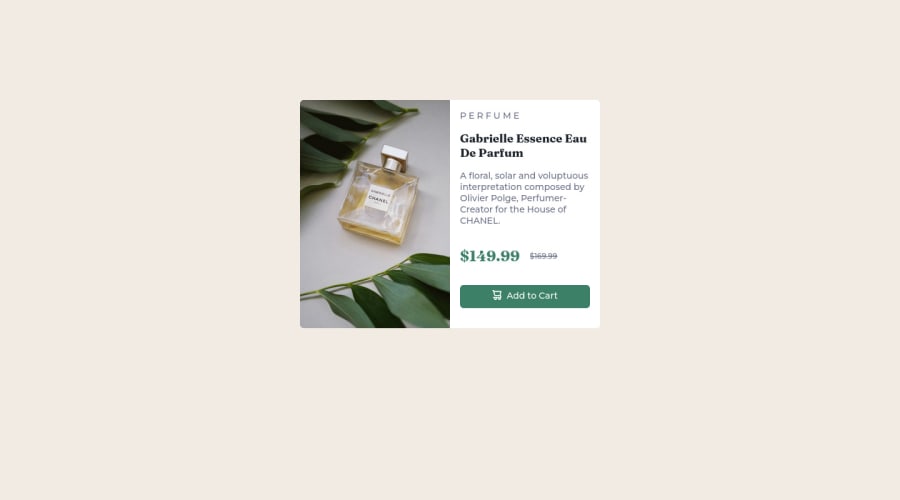
Design comparison
Solution retrospective
I found difficulty in project when I wrapped img in container
When I unwrapped it, there was no whitespace
Usually I find difficulty with "copying" exactly the look of assignment but since I don't have credits for Figma it is what it is for now
Community feedback
- @Swing95Posted about 2 years ago
Hello,
Instead of
<p>P E R F U M E</p>try usingletter-spacing: Xpx;When creating new CSS file use CSS reset below:
* {
  margin: 0;
  padding: 0;
  box-sizing: border-box;
}
For img, I would suggest you to set
img {
  display: block;
  height: 100%;
  width: 100%;
}
and then keep adjusting your section #card
Hope it helps
Good luck :-)
Marked as helpful1@0xevPosted about 2 years ago@Swing95 thank you for a feedback!
* {
  margin: 0;
  padding: 0;
  box-sizing: border-box;
}
This is so neat! Mind explaining what's the logic for resetting box sizing?
Also, I set styles for img like you've said but now the picture is smaller and I don't know how to set it up that picture will be take half of space of #card flex container
0@Swing95Posted about 2 years ago@0xev
Hello,
the logic is to make you life easier. By setting border-box instead of content-box you can be sure that in more complex webpage the div (for example) won't ruin page composition by gaining extra size after changing padding or adding border.
I have made few adjustments to your code.
If you want to have same border radius for your image, you can set
overflow: hidden;in your wrapper (main in your case) instead of setting same border radius again on image.I have wrapped your image to the div and set width to 50%.
Also, there are only 2 correct ways how to center div or smth like that in 2023 (at least in our beginner level)
div {
  display: flex;
  justify-content: center;
  align-items: center;
}
div { display: grid; place-items: center; }Set this to your body also with min-width (and min-height) to 100vw (100vh)
I also set 50% width to your #text
I might forgot some changes to describe here, but I have forked your solution and commented your thing + added grid option. So you can see my changes to your code.
You can check it on here GitHub or in your project forks.
Good luck :-)
Marked as helpful0
Please log in to post a comment
Log in with GitHubJoin our Discord community
Join thousands of Frontend Mentor community members taking the challenges, sharing resources, helping each other, and chatting about all things front-end!
Join our Discord
