

Design comparison

Solution retrospective
I am proud of completing the challenge and getting to learn some new tools to achieve the desired design output similar to the design preview.
What challenges did you encounter, and how did you overcome them?I had challenges perfectly centering the elements but i was able to get it right eventually
What specific areas of your project would you like help with?Probably help with improving the accessibility
Community feedback
- @MarziaJaliliPosted 3 months ago
Happy New Year!!!
Some changes you can make to the HTML file:
- As far as I know dude, there is no need to wrapp the card in more than one element.
Instead of having these two
divelements:<div class="main-container"> and <div class="card">, you could simply have onearticleelement.- use the
pictureelement rather than having two images.
The
pictureelement is very handy when it comes to multiple images for different screen sizes. It gives you the ability to set differentmediaattributes which can declare the screen size for eachsourceelement nested inside.You can take the code below as an example:
<picture>
  <source srcset="(path of the image)"  media="(max-width: 30em)"/>
  <source srcset="(path of the image)"  media="(min-width: 31em)"/>
  <img src="(path of the image)" alt="image"/>
</picture>
the
srcattribute in theimgwill be the fallback source of the image if the other sources are not found.-
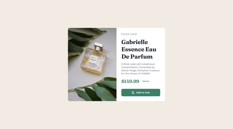
Also, for the
perfume, it will be better to use the<span>instead of a<p>element. -
For improving the accessibility of the web use the
<button>element instead of<div class="add-to-cart-btn">.
You can get rid of the default styles of button, which I guess in this case will only be the border, by the line below:
border: none;Hope it answers your question😁😁
0

Please log in to post a comment
Log in with GitHubJoin our Discord community
Join thousands of Frontend Mentor community members taking the challenges, sharing resources, helping each other, and chatting about all things front-end!
Join our Discord