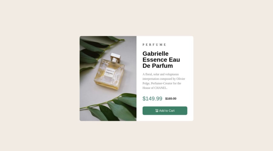
Design comparison
Solution retrospective
I've used the fonts, Fraunce and Montserrat as directed in the styles guide, but when I compare them with the design, they look different. If you have any advice on this, please comment, thank you in advance.
Community feedback
- @daniel-web-developerPosted over 1 year ago
I think what the problem is that you mistook one font for another in some elements. The Fraunces font family should be only in the main title of the product and price.
Also, you should make sure that your font weights are correct.
0 - @peanutbutterjllyPosted over 1 year ago
hey @Ratified š,
I did see that you're referencing those fonts but I couldn't find where you were getting them in your index.html or css file.
what you can do is click the link in the style-guide.md file and copy those specific fonts and then on the right-side panel Google will give you two options to get those into your file; either an import on your markup(HTML) or an @import in your style(CSS) file.
good job on completing the challenge
0@RatifiedPosted over 1 year ago@peanutbutterjlly, I have the fonts installed on my PC, doesn't that suffice?
0@peanutbutterjllyPosted over 1 year ago@Ratified
That suffices for you to see but the server and end-users may/may not have em installed so I'm afraid you'll have to link to them somehow in your HTML or CSS.
I usually just get fonts from Google and put their link in the head of my document but there're other ways of doing so:
0
Please log in to post a comment
Log in with GitHubJoin our Discord community
Join thousands of Frontend Mentor community members taking the challenges, sharing resources, helping each other, and chatting about all things front-end!
Join our Discord