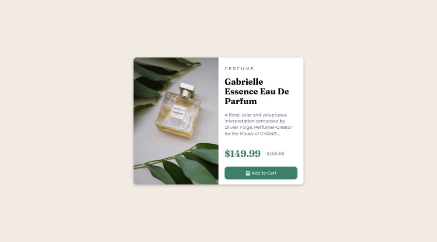
Design comparison
Community feedback
- @MelvinAguilarPosted about 2 years ago
Hi @Miguelaeb 👋, good job on completing this challenge! 🎉
Here are some suggestions you might consider:
- The
<div class="button">container should be abuttonand not adivelement. - You can use a <picture> tag when you need to change an image in different viewports. Using this tag will prevent the browser from loading both images, saving bandwidth and preventing you from utilizing a media query to modify the image.
Example:
<picture> <source media="(max-width: 768px)" srcset="./images/image-product-mobile.jpg"> <img src="./images/image-product-desktop.jpg" alt="your_alt_text"> </picture>-
Improve alternative texts by adding descriptive text to the
altattribute of the product image. The alt attribute enables screen readers to read the information about on-page images and will be displayed instead if an image file cannot load. -
You could use the <del> tag to display the old price:
<del class="old-price">
   <span class="sr-only">Old price: </span>$169.99
</del>
Note that I added the <span> with the
sr-onlyclass to thedelelement, this will provide more information about what your old price is about.The
sr-onlyclass is a class that you can add to hide content visually but is only visible to screen-readers.I hope those tips will help you.
Good job, and happy coding!
Marked as helpful0 - The
Please log in to post a comment
Log in with GitHubJoin our Discord community
Join thousands of Frontend Mentor community members taking the challenges, sharing resources, helping each other, and chatting about all things front-end!
Join our Discord
