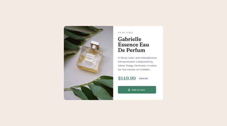


Design comparison

Community feedback
- @VCaramesPosted almost 2 years ago
Hey there! 👋 Here are some suggestions to help improve your code:
- Unfortunately, your challenge is not complete since it is not responsive 😢, which is a requirement for this challenge; a
media querywill help. Here is a link to Google Developer’s site that will teach you how make it 100% responsive:
- The only heading ⚠️ in this component, is the name of the perfume; “Gabrielle Essence Eau De Parfum” . The rest of the text should be wrapped in a
paragraphelement.
- Your
CSS Resetis being underutilized. 😢 To fully maximize 💯 it, you will want to add more to it. Here are some examples that you can freely use 😁: Josh Comeau Reset Eric Meyer Reset
If you have any questions or need further clarification, feel free to reach out to me.
Happy Coding! 🎆🎊🪅
Marked as helpful0@MuminaAPosted almost 2 years ago@vcarames Thank you! for your feedback I went ahead and improved my code to the best of my knowledge, I hope you have the time to reevaluate and please provide anymore feedback if any.
0 - Unfortunately, your challenge is not complete since it is not responsive 😢, which is a requirement for this challenge; a
- @MelvinAguilarPosted almost 2 years ago
Hello there 👋. Good job on completing the challenge !
I have some feedback for you if you want to improve your code.
HTML 📄:
- The
<br>tag is not a semantic element. If a screen reader user is reading the page, they will hear "line break", which breaks the flow of the content. Instead, use CSS properties likemarginandpaddingto add vertical space between elements.
-
You could use the
<del>tag to indicate the price that was before the discount. Additionally, you can use asr-onlyclass to describe the discount. This will help screen reader users to understand that the price was discounted.Example:
<del><span class="sr-only">Old price: </span>$169.99</del>
-
Not all images should have alt text. The cart-icon is a decorative image, it does not add any information to the page. You should use an empty
altattribute instead of a descriptive one. You can read more about this here 📘.If you want to learn more about the
altattribute, you can read this article. 📘. -
You can use the
<picture>tag when you have different versions of the same image 🖼. Using the<picture>tag will help you to load the correct image for the user's device. You can read more about this here 📘.
CSS 🎨:
- Instead of using pixels in font-size, use relative units like
emorrem. The font-size in absolute units like pixels does not scale with the user's browser settings. This can cause accessibility issues for users who have set their browser to use a larger font size. You can read more about this here 📘.
I hope you find it useful! 😄 Above all, the solution you submitted is great!
Happy coding!
Marked as helpful0@MuminaAPosted almost 2 years ago@MelvinAguilar Thank you! and I really appreciated your feedback I went ahead and improved my code to the best of my knowledge, I hope you have the time to reevaluate and please provide anymore feedback if any.
0 - The


Please log in to post a comment
Log in with GitHub
Join our Discord community
Join thousands of Frontend Mentor community members taking the challenges, sharing resources, helping each other, and chatting about all things front-end!
Join our Discord