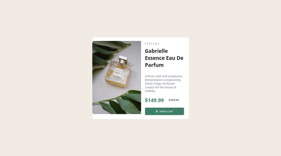
Design comparison
SolutionDesign
Please log in to post a comment
Log in with GitHubCommunity feedback
- @Wasu44
Hello there! I'm a newbie too but let me give you some advice.
You're html structure is pretty good but try to use the semantic html5 tags instead of divs to improve the accessibility and ceo.Also start using rem units instead of px because they are responsive.Next time use CSS reset it is beneficial because it removes default browser styling, creating a consistent starting point for your design across all browsers, here is the link
Join our Discord community
Join thousands of Frontend Mentor community members taking the challenges, sharing resources, helping each other, and chatting about all things front-end!
Join our Discord
