Not Found
Not Found
Not Found
Not Found
Not Found
Not Found
Not Found
Not Found
Not Found
Not Found
Not Found
Not Found
Not Found
Not Found
Not Found
Not Found
Not Found
Not Found
Not Found
Not Found

Submitted

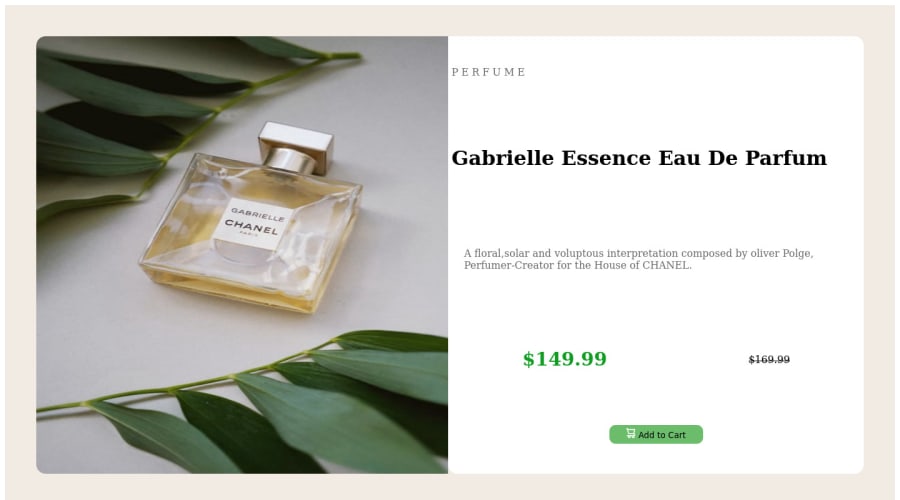
responsive design for product card component

@stefanappdev

Desktop design screenshot for the Product preview card component coding challenge

This is a solution for...

  • HTML
  • CSS
1newbie
View challenge

Design comparison


SolutionDesign

Solution retrospective


can someone tell me how to do this better? most importantly how to use media queries to make designs more responsive . Also please rate what i did so far

Community feedback

Antonela 40

@Aantic96

Posted

Hiya! Let me preface this by saying that I'm fairy new to this as well so I'm only going to comment on the things I believe I know about.

  • Okay, so, first, you might not have noticed, but the files you first downloaded came with style guide, from which you get some info like hsl value for your button and breakpoint for media queries (desktop and mobile).

  • HTML validation point on your page gives back 2 errors which are actually the same. Your img tags are missing <alt> attribute, which is essentially the text that'll appear if your image isn't properly loaded. Keep in mind that <alt> must be declared. However this is what I recently learned - in some cases, for example for this cart icon, you will not want any text appearing - and you can to that by typing it as an empty string, meaning it'll look like this: <img src=./images/icon-cart.svg alt="">

  • This is a tip I got after submitting the challenge, so I'm just parroting the person who reviewed me, but here it goes: your main content should be wrapped in the <main> element for better accessibility.

  • By looking at your code, I've noticed you use <width> and <height> 100% in both card and card-container and I think this is what's causing your whole container to be so stretched.

  • You should avoid pixels and switch to relative units as much as possible. Here's the source I got from another mentor here and it really helped me.

  • And finally the question the question you are most curious about - media queries. I've noticed this in your code, and @media screen and (min-width:500px) and this means your screen breaks once it reaches 499px. This challenge in the style guide asked for a different breakpoint, 374px if I remember correctly, so this is the first thing you should change. The way I see media queries is that you'll use them when you want your elements to behave different in some way. So, font-family, background color, colors in general, will all be the same in mobile and desktop (for this challenge), and you won't be putting them in media queries. However the difference will definitely be in some things, the most obvious one being image positioning. Say you designed your challenge mobile first, what you'll need to is to "fix" the positioning of the desktop one. You'll do it by declaring @media screen and (min-width 375) { } and in the curly brackets you'll write the code that will do that for you. I think you might find this article useful.

Anyway, that's it from me. I hope at least one thing proves to be useful to you and I wish you good luck with further coding! 😊

Marked as helpful

1

Kegan 100

@KeganF

Posted

@Aantic96 you brought up some good points in your feedback!

I just want to add a bit to your point about alt text on images. Alt text will be displayed if the image can't load properly (which you covered!) but is also an important factor in accessibility. For those using screen readers, well-written and descriptive alt text can help convey what an image is showing.

Alt text also helps improve search engine optimization, which you can read more about here!

Cheers! 😊

Marked as helpful

1

@AbdulrhmanSoliman

Posted

Hello @stefanappdev, congratulation on completing your first challenge.

here are some tips to improve your code.

First: To fix the issues of the reporter

  • All <img> HTML tags should contain an alt.
  • Your code should contain at least one <main> HTML tags which include your actual code.

Second: concerning your design you should make the as follows

  • Set a width and height to the container of the design/
  • Apply the background-color property to the <body> HTML tag
  • Reset and render all objects to remove default margin of the element using this code snippet *{ -webkit-box-sizing: border-box; -moz-box-sizing: border-box; box-sizing: border-box; margin: 0; }

Happy coding

Marked as helpful

0

Please log in to post a comment

Log in with GitHub
Discord logo

Join our Discord community

Join thousands of Frontend Mentor community members taking the challenges, sharing resources, helping each other, and chatting about all things front-end!

Join our Discord