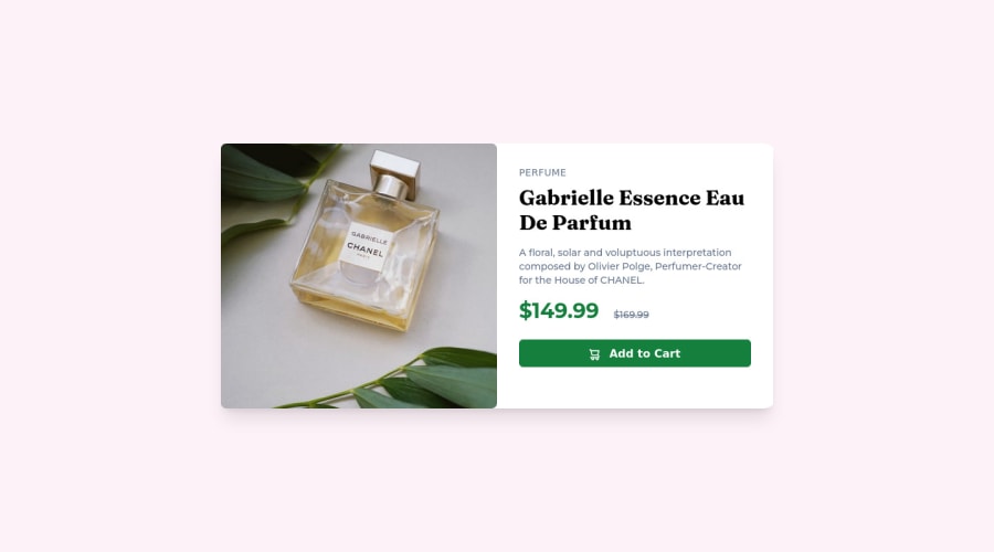
Design comparison
Solution retrospective
- What's your thoughts, tailwind or vanilla CSS?
- Any thoughts on making site responsive easily?
Community feedback
- @correlucasPosted about 2 years ago
πΎHello @numan-iftikhar, Congratulations on completing this challenge!
I've just opened your live site and I can say that you did a great job putting everything together! There's some tips to improve your solution:
1.The image is not responsive yet, a quick way to make any image responsive and respecting the container size is to add
display: block
andmax-width: 100%
to the<img>
selector. To improve the responsiveness even more adding the auto-crop property you can addobject-fit: cover
to make the image crop inside the container its inside.img { display: block; object-fit: cover; max-width: 100%; }
2.Using
<picture>
youβve more control over the elements and its better than using the product image as<img>
orbackground-image
. Look that for SEO and search engine reasons it isn't a better practice to import this product image with CSS since this will make it harder to the image. You can manage both images inside the<picture>
tag and use the html to code to set when the images should change setting the devicemax-width
depending of the device (phone / computer) Hereβs a guide about how to usepicture
:https://www.w3schools.com/tags/tag_picture.asp
βοΈ I hope this helps you and happy coding!
Marked as helpful1@numan-iftikharPosted about 2 years ago@correlucas Hey, I've just applied your suggestions. Have a look at new code plz.
0 - @denieldenPosted about 2 years ago
Hi Numan, congratulations on completing the challenge, great job! π
Some little tips for optimizing your code:
- remove all
margin
frommain
tag - add
object-fit: cover
to the leftimg
element to not stretch it - remove all unnecessary code, the less you write the better as well as being clearer: for example the
div
container of image - to make it look as close to the design as possible add
width: 50rem
to the container of card - remove all
margin
from the container of card - use flexbox to the body to center the card. Read here -> best flex guide
- after, add
min-height: 100vh
to body because Flexbox aligns child items to the size of the parent container
Hope this help! Happy coding π
Marked as helpful1@numan-iftikharPosted about 2 years ago@denielden Hey, thank you so much for your kind review. You remarks and suggestions are great. I try to incorporate them ASAP.
1@denieldenPosted about 2 years ago@numan-iftikhar You are welcome and keep it up :)
0@numan-iftikharPosted about 2 years ago@denielden Hey, I've incorporated your suggested. Have a look again π
1@denieldenPosted about 2 years ago@numan-iftikhar sure you uploaded the changes? I don't see any change
0@numan-iftikharPosted about 2 years ago@denielden Yes, I've. But they are not being reflected in the design solution comparison. I don't know why.
1@numan-iftikharPosted about 2 years ago@denielden I haven't generated the new screenshot. Now I did. You can check it now. Thanks :)
1 - remove all
Please log in to post a comment
Log in with GitHubJoin our Discord community
Join thousands of Frontend Mentor community members taking the challenges, sharing resources, helping each other, and chatting about all things front-end!
Join our Discord