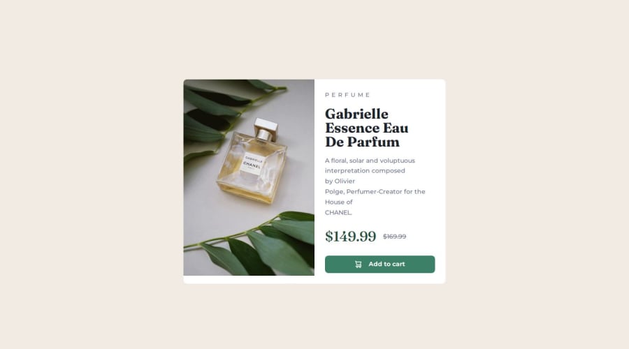
Design comparison
Solution retrospective
After a week of fight i finnaly understood how the @media works and how to use it. This challenge was the hardest so far so i'm very proud that i have enough patience to finish it.
What challenges did you encounter, and how did you overcome them?The most challenging thing was to make site responsive. I watch a lot of videos, read forums to finnaly find someone who can explain this to me. A Kevin Powell YT video was the wallbreaker to me. He explain responsive element very clearly and thanks to him i start using CSS Variables because i found it very useful. My code indeed looks similar to he's so i'll go back to this challenge later when i get more familiar with responsiveness to redo this challenge all by myself.
What specific areas of your project would you like help with?I have to spend more time to be more confident with using flexbox. I still have a hunch that i wont understood this clear enough.
Community feedback
Please log in to post a comment
Log in with GitHubJoin our Discord community
Join thousands of Frontend Mentor community members taking the challenges, sharing resources, helping each other, and chatting about all things front-end!
Join our Discord
