Not Found
Not Found
Not Found
Not Found
Not Found
Not Found
Not Found
Not Found
Not Found
Not Found
Not Found
Not Found
Not Found
Not Found
Not Found
Not Found
Not Found
Not Found
Not Found
Not Found

Submitted

product preview card component

@NATiiCODES

Desktop design screenshot for the Product preview card component coding challenge

This is a solution for...

  • HTML
  • CSS
1newbie
View challenge

Design comparison


SolutionDesign

Solution retrospective


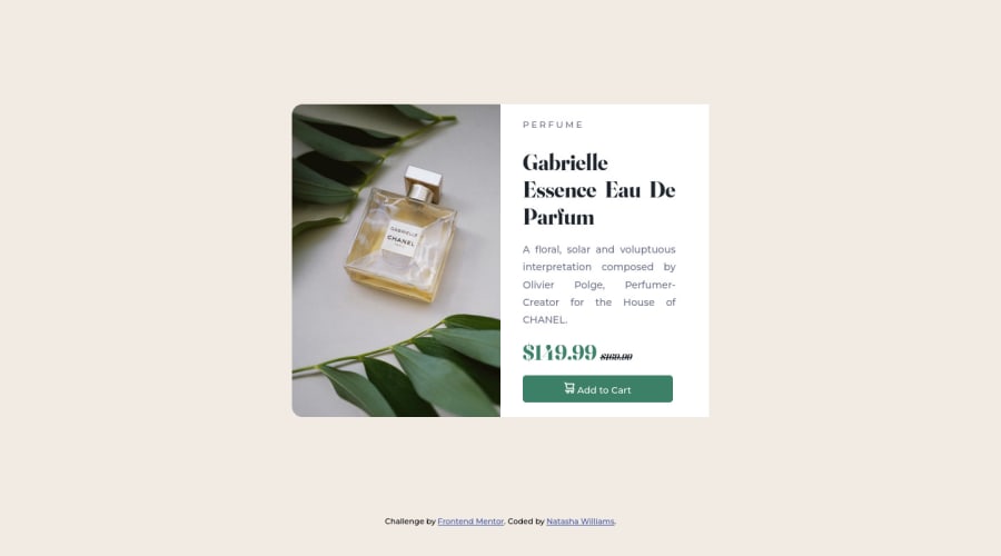
This is my first project with FrontEnd Mentor.

I used alot of W3school and google to figure out some of what I was missing.

I am having difficulty with the paragraph I am trying to get it like the before but I cant seem to figure it out. I am sure it is right in my face the whole time but I am drawing blank at the moment. Especially on the spacing between the description and picture.

If anyone could give me some feedback that would be greatly appreciated.

Thank you!

Community feedback

Elaine 11,400

@elaineleung

Posted

Hi Natasha, congratulations on completing your first challenge! This is a good start and good attempt at positioning elements.

I just want to start by addressing what @ChrisAndrewsDev mentioned: regarding article elements, I'm not sure whether he was referring to the <article> tags or to the inline elements such as <p>, <a>, and <h2>, but in any case, I don't really think it's a problem to use article tags here as long as there's meaningful content in them, and the only real issue could be the accessibility tests. I probably would put all the text elements inside the <article class="paragraph"> tag, and then change the one with the image to a regular <div>, like this:

<div>
  <div class="image">
     <img src="..." class="product-img">
  </div>
  <article>
     <h2></h2>
     <h1></h1>
     <ul></ul>
     <p></p>
     <button></button>
  </article>
</div>

The issue with the text being all squished to the side is just the lack of spacing, which can be taken care of in a few ways. Since you're using float, a quick and "hacky" way would just be to throw a margin-right: 2rem on the product-img element. You might run into some extra spacing which you might be able to take care of using negative margins. While this works in the short run, it's more of a band-aid solution, and if you ask me, it's bound to create more problems than solutions. The way I'd fix this is to use flexbox and not float, and if you need some help with learning flexbox, check out Kevin Powell's videos on Youtube.

Here's my solution for this challenge: https://www.frontendmentor.io/solutions/card-component-using-cube-css-tNaBY0y_Nx

Keep practicing, and once again, great job tackling your first challenge! :)

Marked as helpful

3

@ChrisAndrewsDev

Posted

@elaineleung Excellent, thankyou for correcting my suggestion! I didn't even see the floats being used, it makes much more sense now to me why the element spacing is so close together.

2

@NATiiCODES

Posted

@elaineleung Thank you! that made a lot of sense. It did help with the spacing near the picture. I was able to fix the spacing around the text making it look more accurate!

I also noticed I had a closing </div> that was not in the right place.

I appreciate the feedback!

2
Elaine 11,400

@elaineleung

Posted

@ChrisAndrewsDev No worries at all Chris, I think it's actually helpful to just throw ideas out, and then we all can learn from them!

2
Elaine 11,400

@elaineleung

Posted

@NATiiCODES Glad I could help!

1
Chanda 800

@Chanda-Abdul

Posted

Great Solution overall! The deployed version of you project looks great, and it's very close to the design. Your code is clean and easy to read.

In your HTML file, I noticed a few things.

  • I don't think you need to wrap the <img> in a <div>, you can just add stylings directly to the <img> element. You don't need to use the words picture or image in alt tags for semantic purposes, it's implied that the element is a picture/image. I would probably go with something like <img class="product" src="images/image-product-desktop.jpg" alt="product-main">
  • For semantic purposes you probably don't want to name a class after a possible element. With <article class="paragraph"> the paragraph class could get confused for a <p>/paragraph element. I would change this to something like <article class="content"> or <article class="product-information">
  • also for semantic reasons, <h1>'s should come before <h2>'s and <h2>'s should come before <h3>'s, etc. I would change this to
<h1> Perfume </h1>
<h2> Gabrielle Essence Eau De Parfum </h2>

Your css file, looks great!

I hope that helps! Keep up the good work!

Marked as helpful

1

@NATiiCODES

Posted

@Chanda-Abdul Thank you for the feedback! It helped out a lot. I appreciate it!.

0
Elaine 11,400

@elaineleung

Posted

@Chanda-Abdul Great points, and I just want to add something here about images: I agree that wrapping the image inside a <div> may not be necessary if the image stays the same and that no cropping is needed, and even if cropping is needed there could be other ways, like using clip path. But for cropping with responsiveness, like in the case of this challenge, I find it much easier to wrap the image and use object-fit. But if there are other ways to do it please let me know as I'd love to learn as well!

0

@ChrisAndrewsDev

Posted

Howdy @NATiiCODES!

There does seem to be some spacing weirdness going on with the solution, my assumption (and hopefully a more experienced developer can correct me if I'm wrong) is that it's because you're using article elements for the majority of the HTML.

From my understanding, the <article> tag serves a super specific role and generally doesn't get used for the bulk of the structure of a document.

I would suggest trying to change the <article> tags to <div> tags, or preferably semantic tags, like <section> for larger containers, followed by <div> tags inside.

I've got a feeling this should help with the elements being all scrunched together and allow you to apply styles easier!

Good luck and let me know if it works at all!

2

@NATiiCODES

Posted

@ChrisAndrewsDev Thank you! I do appreciate the feeback!

0
IRVINE MESA 1,855

@DrMESAZIM

Posted

HI Natasha

this was very good attempt on your first challenge. Your coding needs some few amendments especial on areas like spacing using margin properties or alternatives padding or text-align properties

If you find this a challenge to resolve let me know and I could do a YouTube video for your editing your project code

0

@alimuddinhasan

Posted

Hello there,

First of all, you need to understand how the layout works with CSS. You can use flexbox or grid for this purpose. Here are some references to it https://css-tricks.com/snippets/css/a-guide-to-flexbox/ https://css-tricks.com/snippets/css/complete-guide-grid/

As the space between the picture and product detail, you can use margin or padding. To understand them, you need to know how the HTML element works. You can learn it from any resources, but I recommend you to learn from https://www.freecodecamp.org/learn/2022/responsive-web-design/

0

@NATiiCODES

Posted

@alimuddinhasan thank you!

0

Please log in to post a comment

Log in with GitHub
Discord logo

Join our Discord community

Join thousands of Frontend Mentor community members taking the challenges, sharing resources, helping each other, and chatting about all things front-end!

Join our Discord