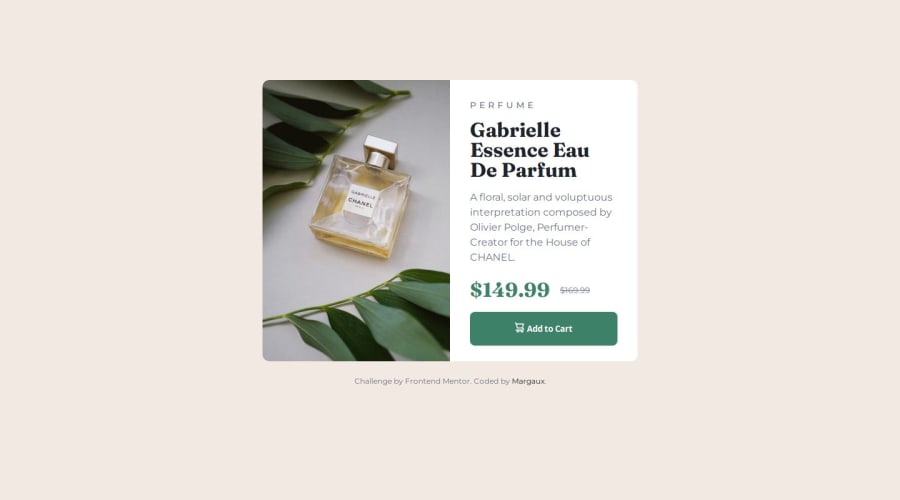
Design comparison
Solution retrospective
I’m proud of how quickly I was able to adapt to the design and efficiently implement it using Figma. For now, I can’t pinpoint anything I would do differently next time, but I’m always open to improving my workflow.
What challenges did you encounter, and how did you overcome them?I struggled to remember how to display different images based on screen size. I resolved this by searching for the solution on MDN, which provided clear guidance on using media queries for responsive images.
What specific areas of your project would you like help with?I would appreciate any advice on optimizing the use of media queries and reducing redundant CSS to streamline the code.
Community feedback
- @sudhanshusingh-gPosted 8 months ago
The design and the solution are somewhat same,keep up the good work.
0
Please log in to post a comment
Log in with GitHubJoin our Discord community
Join thousands of Frontend Mentor community members taking the challenges, sharing resources, helping each other, and chatting about all things front-end!
Join our Discord
