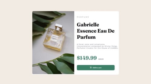
Product Preview card component

Solution retrospective
That I finished this challenge, I re-did it twice as I was not happy with my first attempt and thought I could do better and that I implemented flexbox for the first time in one of these challenges.
What challenges did you encounter, and how did you overcome them?I struggled quite a bit with making this responsive, still not happy with the responsive side of it.
I went with a desktop first approach but may switch to a mobile first approach for future.
The main thing I struggled with was re-sizing the component to fit properly on screen for the different widths and some other parts - for example the paragraph regarding the product description does not stay inside the container.
What specific areas of your project would you like help with?I am a bit confused regarding some sections of my code, firstly I'm unsure why I need to use "display: flex" in multiple places in order to centre the card component. For example in the body section I use display flex and then on the div "flex-container" I also have to specify display:flex or the card component isn't centered.
I also need help with responsiveness, I feel like this should not been as hard as I found it to make this responsive given the layout of the card I thought changing the flex direction to column would do 90% of the work but I spent alot of time with the dev tools open in chrome trying to resize components to make it look decent.
if anyone has any advice or pointers on an easier way to make this responsive that would be great!
Please log in to post a comment
Log in with GitHubCommunity feedback
No feedback yet. Be the first to give feedback on RKennedyy's solution.
Join our Discord community
Join thousands of Frontend Mentor community members taking the challenges, sharing resources, helping each other, and chatting about all things front-end!
Join our Discord