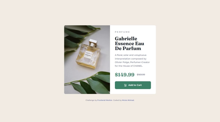
Product Preview Card using HTML and CSS (Kevin Powell's walkthrough)
Design comparison
Solution retrospective
Product Preview Card using HTML and CSS (Kevin Powell's walkthrough)
Community feedback
- @petritnurediniPosted 10 months ago
Congratulations on completing your Product Preview Card Component project! 🎉 It's fantastic to see your hard work come to fruition with a beautifully designed and well-coded project. Here are some best practices and suggestions to enhance your work even further:
-
Accessibility Enhancements:
- Use
alt
attributes effectively in your images to provide descriptive text for screen readers. - Make sure that the button is accessible. For example, if the button contains an icon, ensure that it has appropriate
aria-label
attributes for screen reader users.
- Use
-
CSS Organization:
- Consider organizing your CSS properties consistently (e.g., positioning, box model, typography, visual). This makes your stylesheet easier to read and maintain.
- Use comments to separate sections of your CSS for better readability.
-
Responsive Design:
- Great use of media queries for responsive design! Ensure that the layout looks good and functions well on all device sizes, including tablets and smaller mobile devices.
- Test your page in different browsers to ensure compatibility and a consistent user experience.
-
Performance Optimization:
- Optimize your images to reduce file size without losing quality. Tools like TinyPNG can help reduce image file sizes.
-
Semantic HTML:
- Good job using semantic elements like
<main>
and<article>
. Continue this practice as it improves SEO and accessibility.
- Good job using semantic elements like
-
Font Loading:
- Ensure that web fonts are loaded efficiently to minimize render-blocking. You can use
font-display: swap
in your font-face rule to enhance text visibility while fonts are loading.
- Ensure that web fonts are loaded efficiently to minimize render-blocking. You can use
-
Code Reusability and Maintenance:
- Consider using CSS variables for frequently used values, such as margins and paddings. This makes it easier to maintain and change the values consistently across your stylesheet.
-
Hover and Focus States:
- Make sure that all interactive elements like buttons have distinct hover and focus states. This improves usability, especially for keyboard users.
References for Further Learning:
- For accessibility: Web Accessibility Initiative (WAI)
- For CSS organization: CSS Guidelines
- For responsive design: Responsive Web Design Basics
- For image optimization: Image Optimization
Keep up the great work and continue exploring new challenges and technologies. Your journey as a developer is off to a strong start, and I can't wait to see what you create next! 💻🌟
0 -
Please log in to post a comment
Log in with GitHubJoin our Discord community
Join thousands of Frontend Mentor community members taking the challenges, sharing resources, helping each other, and chatting about all things front-end!
Join our Discord