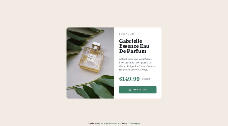
Product preview card component


Design comparison

Solution retrospective
I'm more comfortable using grid and flexbox layouts. I've also adopted the BEM (Block, Element, Modifier) naming convention for SCSS. While I prioritize using modern fonts, I ensure compatibility with older browsers. Matching exact spacing and fonts from design files can be challenging. For future projects, I'll focus on creating adaptive solutions with visually appealing elements. I won't strive for pixel-perfect font replication, as it can be time-consuming.
What challenges did you encounter, and how did you overcome them?The challenge was finding the exact padding and fonts used in the design files. I figured it out through experimentation.
What specific areas of your project would you like help with?At this point i am more comfortable with working in css and html. Do you use the same font sizes and spacings as in the design photos? Do you try to match the exact elements in design files, like font sizes and spacing, or do you use your best judgment to achieve the most accurate representation? Also if you find any mistakes or have suggestions for improvement, please let me know. I will be very grateful.
Please log in to post a comment
Log in with GitHubCommunity feedback
No feedback yet. Be the first to give feedback on Darek's solution.
Join our Discord community
Join thousands of Frontend Mentor community members taking the challenges, sharing resources, helping each other, and chatting about all things front-end!
Join our Discord