Not Found
Not Found
Not Found
Not Found
Not Found
Not Found
Not Found
Not Found
Not Found
Not Found
Not Found
Not Found
Not Found
Not Found
Not Found
Not Found
Not Found
Not Found
Not Found
Not Found

Submitted

Product preview card component

Aliho 50

@A-l-i-h-o

Desktop design screenshot for the Product preview card component coding challenge

This is a solution for...

  • HTML
  • CSS
1newbie
View challenge

Design comparison


SolutionDesign

Solution retrospective


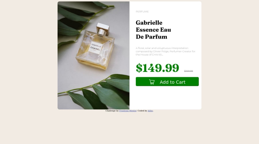
Hi everyone! This is my second project.

I had a hard time with the size of the white frame and the image.

This project gave me a lot of knowledge in HTML and CSS and allowed me to use tags and rules that I didn't know before.

Feel free to give me feedback on what needs to be changed in the code and what can be improved.

Thanks in advance!

Community feedback

Adriano 34,090

@AdrianoEscarabote

Posted

Hi Aliho, how are you?

I really liked the result of your project, but I have some tips that I think you will enjoy:

  • To improve the design of your project, there is a file that comes when you download the challenge images, always pay attention to the colors, it helps a lot to make it as equal as possible!

  • To align some content in the center of the screen, always prefer to use display: flex; it will make the layout more responsive!

Example:

body {
    margin: 0;
    padding: 0;
    display: flex;
    align-items: center;
    justify-content: center;
    min-height: 100vh;
}

The rest is great!

I hope it helps... 👍

Marked as helpful

0

@Miguelaeb

Posted

Hi @A-l-i-h-o, congratulations on your solution!

Great solution and a great start! From what I saw you’re on the right track. I’ve a few suggestions for you that you can consider adding to your code:

Use a CSS reset to avoid all the problems you can have with the default CSS setup, removing all margins, and making the images easier to work, see the link below where you can download this file which contains the normalize.css: https://necolas.github.io/normalize.css/

Add a margin of around margin: 20px to avoid the card touching the screen edges while it scales down.

Use relative units as rem or em instead of px to improve your performance by resizing fonts between different screens and devices. These units are better to make your website more accessible. REM does not just apply to font size, but to all sizes as well.

To center the main div or container you can use display: flex; align-items: center; justify-content: center; min-height: 100vh

Also, you should have added some margin-top to the green button and always try to follow the style guide that is in the package.

Here's my solution for this challenge if you want to see how I build it: https://www.frontendmentor.io/solutions/product-preview-card-component-MCflXO_TZz

I hope this helps you and happy coding!

Marked as helpful

0

Please log in to post a comment

Log in with GitHub
Discord logo

Join our Discord community

Join thousands of Frontend Mentor community members taking the challenges, sharing resources, helping each other, and chatting about all things front-end!

Join our Discord