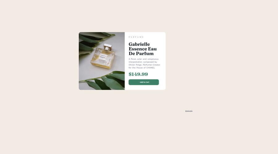
Design comparison
Solution retrospective
-
I found the floating part of my code more difficult until I set the text margin to auto but I'm kinda still unsure of it but it works tho!!!
-
I'm not of how I position the discount
.discount { position: absolute; right: 50px; bottom: 205px; text-decoration: line-through; }
-
my questions are; i. why do I need to set the text margin to auto when floating them to the left and it works on the right without setting it to auto? ii. I will like to know more about the difference between absolute positioning and relative positioning (as in how they are being used)
Community feedback
- @SinisaVukmirovicPosted almost 2 years ago
Hello!
No, no, no, thats not how you do "floating" or absolute position elements... Absolute positioned but to what? Parent container needs to be set to relative position so that the absolute positioned element knows in compared to what to position itself.
A lot of things in your code needs correcting.
Here is where to start learning:
Playlist tutorial on positioning
See you when you fix your code! Good luck!
Marked as helpful0@Noah2509Posted almost 2 years ago@SinisaVukmirovic yeah, thank you!! I know a lot of my code will need to be corrected. I'm a beginner and newbie in the tech field and this is also my first challenge
I'm so happy you took the time to comment on my solution. Thank you so much once again!!
But can you please point out some of the areas where I need to correct my code??
0@SinisaVukmirovicPosted almost 2 years ago@Noah2509 Start with fixing errors ini your report. Use semantic elements in HTML. Errors in your report are mostly about that.
This "Document should have one main landmark" means you are missing <main> semantic element in your html. Landmark just means element.
This "All page content should be contained by landmarks" means all non-semantic elements should be inside of semantic elements, and not directly inside of <body> element.
More about semantic elements
Marked as helpful0@Noah2509Posted almost 2 years ago@SinisaVukmirovic Hello sir, can you please help me check my new solution https://www.frontendmentor.io/solutions/product-preview-card-component-gVDZ3Y2EB4
0@SinisaVukmirovicPosted almost 2 years ago@Noah2509 Its better, definitely looks better on the desktop screens.
But you are missing the responsiveness part. Its not good on mobile screens. You need media-queries code to make it work on mobile screens.
Watch these tutorials on media queries, hope they help you understand and learn responsiveness with media queries.
Good luck!
0 - @HassiaiPosted almost 2 years ago
replace <div class="intro"> with the main tag, <h3> with <p>, <h2> with <h1> and <h1> with <h2> to fix the accessibility issues
To center .intro on the page, add min-height:100vh; display: flex; align-items: center: justify-content: center; or min-height:100vh; display: grid place-items: center to the body. instead of giving the body a padding value and .intro a margin-top value.
Increase the width of .intro to get the desire width in the design. give .product-img a width of 50%.
Hope am helpful. Happy coding
Marked as helpful0@Noah2509Posted almost 2 years ago@Hassiai
hello, can you help me check my new solution
https://www.frontendmentor.io/solutions/product-preview-card-component-gVDZ3Y2EB4
0
Please log in to post a comment
Log in with GitHubJoin our Discord community
Join thousands of Frontend Mentor community members taking the challenges, sharing resources, helping each other, and chatting about all things front-end!
Join our Discord
