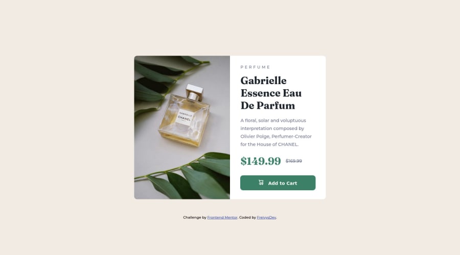
Submitted over 2 years ago
Product Preview Card Component
#accessibility#bem#progressive-enhancement#semantic-ui
@FreivysDev
Design comparison
SolutionDesign
Please log in to post a comment
Log in with GitHubCommunity feedback
- @Deevyn9
Hi Freivys, congrats on completing this solution, It looks really good. However, you should add a bit of padding to the sides of the body so it has some gap with the container for screens <350px, also you should change the
heighton the container tomin-heightbecause it might extend if the screen's width reduces. Lastly, you should center the container vertically of smaller screens.I hope you find this comment helpful.
Happy Coding! 🎉
Join our Discord community
Join thousands of Frontend Mentor community members taking the challenges, sharing resources, helping each other, and chatting about all things front-end!
Join our Discord
