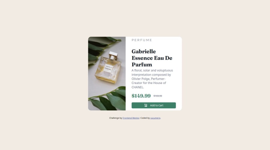


Design comparison
SolutionDesign

Community feedback
- @StroudyPosted 3 months ago
Hey, I like what you have done here, Some things stand out to me,
-
object-fit: cover; margin-bottom: 1rem; width: 100%; max-width: 200px; height: 100%; max-height: 600px; border-radius: var(--main-border-radius) var(--main-border-radius) 0 0;``` - Changing your
max-width: 200pxtomax-width: 100%,max-height: 600px;tomax-height: 100%;and removingheight: 100%;andwidth: 100%;because they are now redundant, will make your image more responsive. - Using
max-width: 100%ormin-width: 100%is way more responsive than justwidth:100%, check out this article also from the same Frontend mentor dev responsive-meaning, she goes into more detail. - You should avoid using
ID selectors #and useclass=""Instead because#IDis usually used for JavaScript or other reasons not styling. - You should avoid using
pxas it is an absolute unit and not a responsive unit likeremorem, You should look at this article from a Frontend mentor dev, Why font-size must NEVER be in pixels. - Another great resource for px to rem converter.
- Line height is usually unitless instead of
line-height: 150%;should useline-height: 1.5;this means it is 1.5 x the font-size, unitless value ensures that the line height will scale proportionately. - You should apply a full modern reset to make things easier as you build, check out this site for a Full modern reset
- Check out this article from a Frontend mentor dev about responsive-meaning.
- When on a mobile screen your
<img>is meant to change to the second<img>you can do this using a<picture>element. - Using a naming convention like BEM, Using proper naming will prepare you for the changes in design of the website.
I hope some of this helps, Really give those articles a good read and try to understand responsive web design, Happy coding look forward to seeing more from you!
Marked as helpful0 -

Please log in to post a comment
Log in with GitHub
Join our Discord community
Join thousands of Frontend Mentor community members taking the challenges, sharing resources, helping each other, and chatting about all things front-end!
Join our Discord