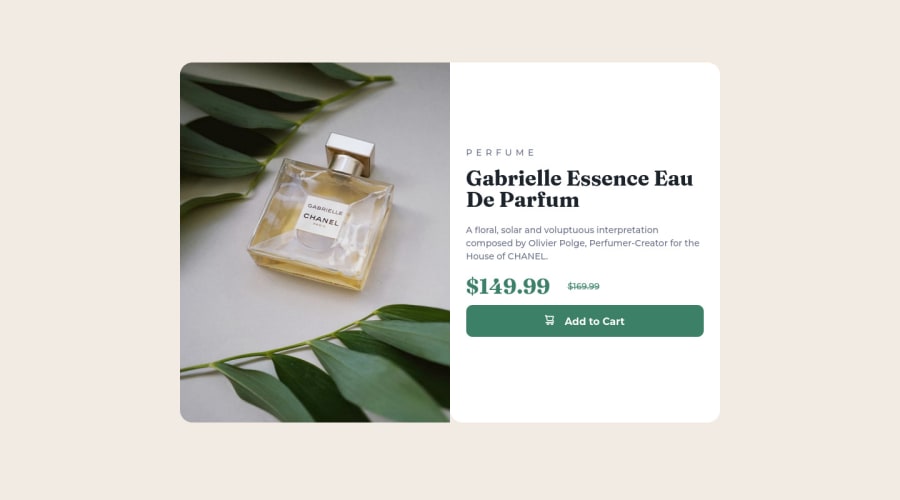
Design comparison
Solution retrospective
I had a lot of problems with the flex box. I had to try again and again until find a way to put all the items in the correct place! But it was good for me to practice and discover where I need to improve.
Please log in to post a comment
Log in with GitHubCommunity feedback
- Account deleted
Hey there! 👋 Here are some suggestions to help improve your code:
- The image’s
alt tagdescription needs to be improved upon to better describe what it is. You will want to assume that you are describing the image to a someone.
More Info:📚
https://www.w3.org/WAI/tutorials/images/
- This component requires the use of two images 🎑 at different breakpoints. The
pictureelement will facilitate this.
Here is an example of how it works: EXAMPLE
Syntax:
  <picture>
    <source media="(min-width: )" srcset="">
    <img src="" alt="">
  </picture>
More Info:📚
https://www.w3schools.com/html/html_images_picture.asp
- The only heading in this component, is the name of the perfume; “Gabrielle Essence Eau De Parfum” . The rest of the text should be wrapped in a
paragraphelement.
- Currently, the old price (169.99) 🏷 is not being properly announced to screen readers. To fix this, you are going to wrap the the price in a
delelement and inside it you will add aspanelement with ansr-only classthat will state something like “The previous price was…” and use CSS to make it only visible to screen readers.
More Info:📚
- Your "button" was created with the incorrect element. It should be created using the
buttonelement. So that when the user clicks on the button (with the help of JS) it should add the product to the cart.
More Info:📚
If you have any questions or need further clarification, feel free to reach out to me.
Happy Coding!🎄🎁
Marked as helpful - The image’s
- @catherineisonline
I would add some hover effect for the button and also the previous price is supposed to be grayish, not green 🙌🏻
Join our Discord community
Join thousands of Frontend Mentor community members taking the challenges, sharing resources, helping each other, and chatting about all things front-end!
Join our Discord
