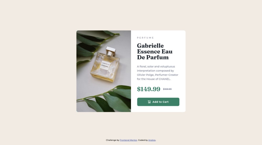
Design comparison
Community feedback
- @VCaramesPosted over 2 years ago
Hey @XJuanRocksX, some suggestions to improve you code:
-
The Section Element is being used incorrectly. Remove it.
-
- The Alt Tag description for the image needs to be improved upon. You want to describe what the image is; they need to be readable. Assume you’re describing the image to someone.
-
When using images that are different size for different breakpoints, its’ far more effective to use the <picture> element. By using this element not are able to use different size images, you can also save on bandwidth, meaning your content loads faster.
Syntax:
  <picture>
    <source media="(min-width: )" srcset="">
    <img src="" alt="">
  </picture>
Source:
https://www.w3schools.com/html/html_images_picture.asp
https://web.dev/learn/design/picture-element/
-
There should only be one heading in this challenge and thats for the Perfume’s Name. Everything else should be using a Paragraph Element.
-
The old price isnt being announce properly to screenreaders. You want to wrap it in a Del Element and include a sr-only text explaining that this is the old price.
-
Your CSS Reset is extremely bare. You want to add more to it.
Here are few CSS Resets that you can look at and use to create your own CSS Reset or just copy and paste one that already prebuilt.
https://www.joshwcomeau.com/css/custom-css-reset/
https://meyerweb.com/eric/tools/css/reset/
http://html5doctor.com/html-5-reset-stylesheet/
Happy Coding!
Marked as helpful1 -
Please log in to post a comment
Log in with GitHubJoin our Discord community
Join thousands of Frontend Mentor community members taking the challenges, sharing resources, helping each other, and chatting about all things front-end!
Join our Discord
