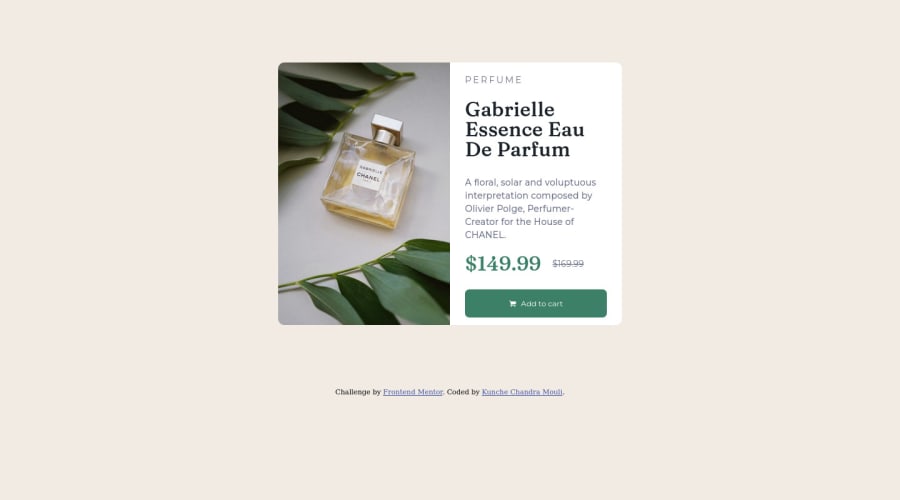


Design comparison

Community feedback
- @correlucasPosted about 2 years ago
👾Hello @chanduKunche, Congratulations on completing this challenge!
Your solution its almost done and I’ve some tips to help you to improve it:3
1.Use units as
remoreminstead ofpxto improve your performance by resizing fonts between different screens and devices.To save your time you can code your whole page using
pxand then in the end use a VsCode plugin called px to rem here's the link → https://marketplace.visualstudio.com/items?itemName=sainoba.px-to-rem to do the automatic conversion or use this website https://pixelsconverter.com/px-to-rem2.Use the THE PICTURE TAG that is a shortcut to deal with the multiple images in this challenge. So you can use the
<picture>tag instead of importing this as an<img>or using a div withbackground-image. Use it to place the images and make the change between mobile and desktop, instead of using adivorimgand set the change in the css withdisplay: nonewith the tag picture is more practical and easy. Note that for SEO / search engine reasons isn’t a better practice import this product image with CSS since this will make it harder to the image. Manage both images inside the<picture>tag and use the html to code to set when the images should change setting the devicemax-widthdepending of the device desktop + mobile.Check the link for the official documentation for
<picture>in W3 SCHOOLS:https://www.w3schools.com/tags/tag_picture.aspSee the example below:
<picture> <source media="(max-width:650px)" srcset="./images/image-product-mobile.jpg"> <img src="./images/image-product-desktop.jpg" alt="Gabrielle Parfum" style="width:auto;"> </picture>👨💻Here's my solution for this challenge if you wants to see how I build it: https://www.frontendmentor.io/solutions/product-preview-card-vanilla-css-and-custom-hover-state-on-hero-85A1JsueD1
✌️ I hope this helps you and happy coding!
Marked as helpful0@chanduKunchePosted about 2 years ago@correlucas Thank you so much for the tips. They will help me a lot. I will try to improve my code.
0 - @MelvinAguilarPosted about 2 years ago
Hi @chanduKunche 👋, good job for completing this challenge!
Here are some suggestions to improve your code:
- Try to fix the issues indicated by the report in this solution.
- The container is not center. You can use flexbox or grid to center things
body {
   width: 100%;
   min-height: 100vh;
   display: grid;
   place-content: center;
}
Remove
margin: 0 auto;andmargin-top: 100px;from the container.More information: A Complete Guide to Flexbox (CSS-Tricks) | How TO - Center Elements Vertically (W3Schools)
- The
<h1>element is the main heading in a web page. There should only be one<h1>tag per page. The HTML Section Heading elements (Reference)
Solution:
<p style="color:hsl(158, 36%, 37%);">$149.99</p>- You could use the <del> tag to display the old price:
<del>$169.99</del>I hope those tips will help you.
Good Job and happy coding !
0@chanduKunchePosted about 2 years ago@MelvinAguilar Thank you so much!! It is really helpful feedback. I will try to improve my code.
0


Please log in to post a comment
Log in with GitHub
Join our Discord community
Join thousands of Frontend Mentor community members taking the challenges, sharing resources, helping each other, and chatting about all things front-end!
Join our Discord