Not Found
Not Found
Not Found
Not Found
Not Found
Not Found
Not Found
Not Found
Not Found
Not Found
Not Found
Not Found
Not Found
Not Found
Not Found
Not Found
Not Found
Not Found
Not Found
Not Found

Submitted

Product preview card component

AndrewFerrer000β€’ 20

@AndrewFerrer000

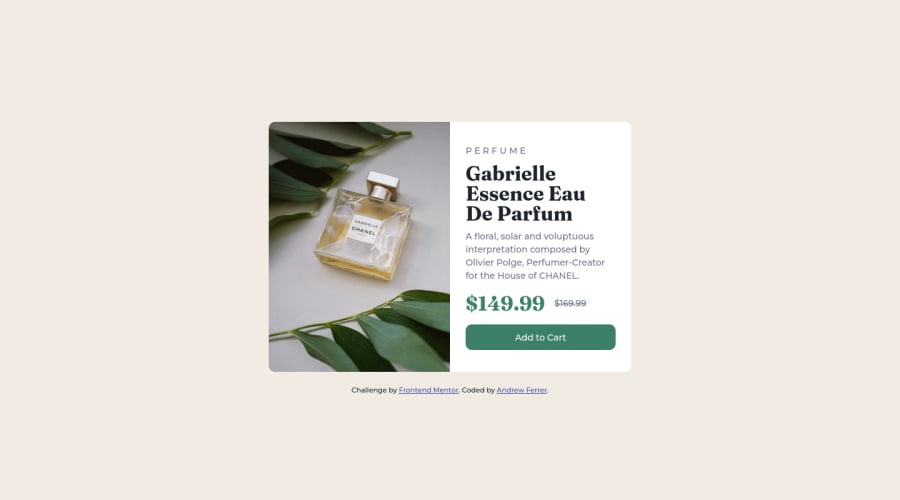
Desktop design screenshot for the Product preview card component coding challenge

This is a solution for...

  • HTML
  • CSS
1newbie
View challenge

Design comparison


SolutionDesign

Solution retrospective


  • I'm having a problem on naming classes in every elements, I am not really sure if class="product__btn" is correct even that's the only button in component. Do you have any suggestion on how can I name that particular element?

  • Regarding on the image in component, we know that the image will change depends on the window size, what I did is put class="hide-in-desktop" on the first image (Anyway I'm doing mobile-first) and class="show-in-desktop" to other image ,it is the only solution I came up without using Javascript, is there another way to do it?

Thank you

Community feedback

@MelvinAguilar

Posted

Hello there πŸ‘‹. Good job on completing the challenge !

I have some feedback for you if you want to improve your code.

Questions:

  • In my humble opinion, I think you have used the BEM naming convention correctly.
  • You can use the <picture> tag when you have different versions of the same image πŸ–Ό. Using the <picture> tag will help you to load the correct image for the user's device saving bandwidth and improving performance. You can read more about this here πŸ“˜.

    Example:

    <picture>
        <source media="(min-width: 1440px)" srcset="./images/image-product-desktop.jpg ">
        <img src="./images/image-product-mobile.jpg" alt="{your alt text goes here}">
    </picture>
    

HTML πŸ“„:

  • Use the <main> tag to wrap all the main content of the page instead of the <div> tag. With this semantic element you can improve the accessibility of your page.
  • Use the <footer> tag to wrap the footer of the page instead of the <div class="attribution">. The <footer> element contains information about the author of the page, the copyright, and other legal information.
  • Having two or more h1 tags in a webpage is not recommended because it can be confusing for search engines. Search engines use the h1 tag to determine the main topic of a page. <h1 class="product__current-price">$149.99</h1> should not be level-one heading
  • You could use the <del> tag to indicate the price that was before the discount. Additionally, you can use a sr-only class to describe the discount. This will help screen reader users to understand that the price was discounted.

    Example: <del><span class="sr-only">Old price: </span>$169.99</del>

CSS 🎨:

  • Instead of using pixels in font-size, use relative units like em or rem. The font-size in absolute units like pixels does not scale with the user's browser settings. This can cause accessibility issues for users who have set their browser to use a larger font size. You can read more about this here πŸ“˜.

I hope you find it useful! πŸ˜„ Above all, the solution you submitted is great!

Happy coding!

Marked as helpful

2

AndrewFerrer000β€’ 20

@AndrewFerrer000

Posted

@MelvinAguilar Thank you very much, I will try to use the em and rem unit in my next challenge and also try to wrap everything in their necessary element block such as header main footer.

0

Please log in to post a comment

Log in with GitHub
Discord logo

Join our Discord community

Join thousands of Frontend Mentor community members taking the challenges, sharing resources, helping each other, and chatting about all things front-end!

Join our Discord