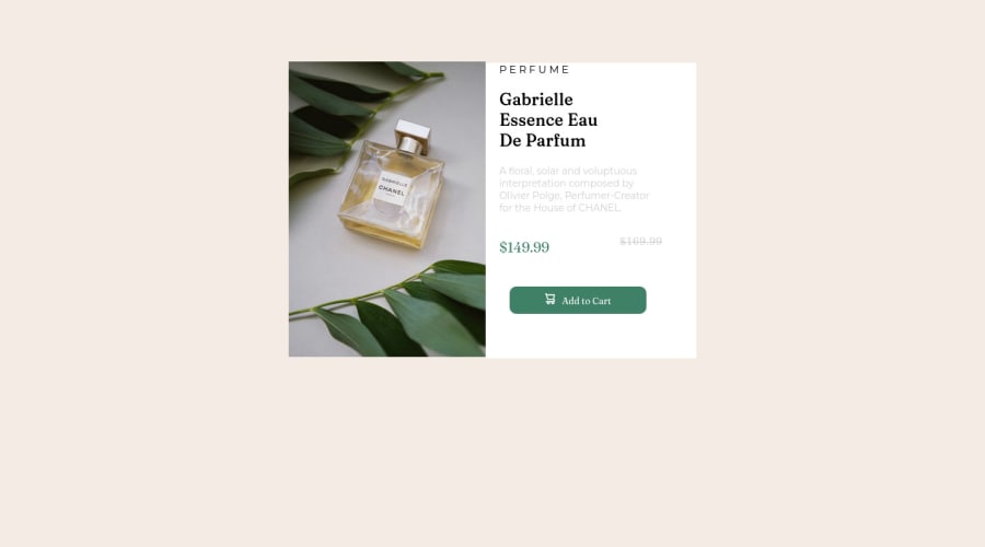
Design comparison
Solution retrospective
Day #3 of Front End development Help ;(
Community feedback
- @VCaramesPosted over 2 years ago
Hey there! 👋 Here are some suggestions to help improve your code:
- Do not forgot to check your FEM report, to see what is incorrect and update your code with it before moving on to the next challenge.
- Your HTML code needs to be rewritten, a lot of the elements are not being used correctly. You will want to study up on proper semantic use.
- Do not capitalize "perfume" in HTML as it is not accessible friendly. Instead you will want to style it in CSS.
- This component requires the use of two images 🎑 at different breakpoints. The
pictureelement will facilitate this.
Here is an example of how it works: EXAMPLE
Syntax:
  <picture>
    <source media="(min-width: )" srcset="">
    <img src="" alt="">
  </picture>
More Info:📚
https://www.w3schools.com/html/html_images_picture.asp
- For improved accessibility 📈 for your content, it is best practice to use
remfor yourfont-sizeand other property value. Whileemis best formedia-queries. Using these units gives users the ability to scale elements up and down, relative to a set value.
- Your content is not fully responsive. Here is a link to Google Developer’s site that will teach you how make it 100% responsive:
- A lot of the headaches and repeated properties can be be overcome by implementing a proper CSS Reset.
Here are few CSS Resets that you can look at and use to create your own or just copy and paste one that is already prebuilt.
If you have any questions or need further clarification, feel free to reach out to me.
Happy Coding! 🎄🎁
Marked as helpful1 - @nott7Posted over 2 years ago
Hi!
On
<div class="information">you can usedisplay: flex;flex-direction:column;andjustify-content:center;for center the div andborder-radius: 0 10px 10px 0On the image you can use
border-radius: 10px 0 0 10px;For the button you can delete
position:absolute;and all the margin and also usefont-family: inherit;On the price section you can use
display: flex;justify-content:space-between;andalign-items: center;, done this on the childrens you can delete float.You can delete
align-items: center;and height onmain.I may have forgotten or wrong something , if you still need you can also write to me!
Marked as helpful0@YouLackHopePosted over 2 years ago@nott7 How can i contact you, like social media or anything
0
Please log in to post a comment
Log in with GitHubJoin our Discord community
Join thousands of Frontend Mentor community members taking the challenges, sharing resources, helping each other, and chatting about all things front-end!
Join our Discord
