Submitted about 2 years ago
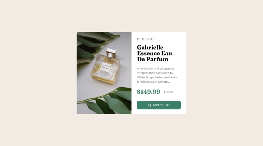
Product preview card component with SASS and FLEXBOX.
#sass/scss
@Guilherme-Goncalves-de-Souza
Design comparison
SolutionDesign
Solution retrospective
🇧🇷 Deixe aqui seu feedback ou sua crítica construtiva!!!
en Leave your feedback or constructive criticism here!!!
Community feedback
Please log in to post a comment
Log in with GitHubJoin our Discord community
Join thousands of Frontend Mentor community members taking the challenges, sharing resources, helping each other, and chatting about all things front-end!
Join our Discord
