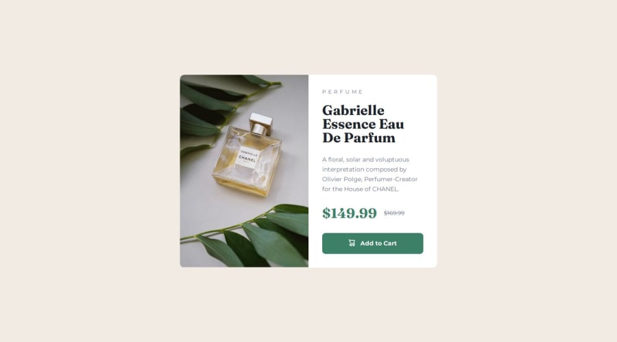
Design comparison
Solution retrospective
I tried to use em and rem units for everything to improve accessibility and responsiveness.
What specific areas of your project would you like help with?I would like to fined a better way to define the spaces between the card inner elements.
Community feedback
- @marjskyPosted 9 months ago
Your website is perfect match to design requirement. In HTML file, your structure look neat and sense everything. Your implementation in CSS is completed without missing or vague coordinate to HTML document. Good job!
Marked as helpful1 - @beowulf1958Posted 9 months ago
Your website looks great; pixel perfect implementation of the design. I particularly liked the BEM variables names in the html; this makes it super easy to read and maintain.
Because your code is so easy to follow, you taught me how to do something I did not know. I spent several days trying to get the <picture> element to work right, but it always ended up with a white strip at the bottom. The img on your page covers the entire left side in desktop view. Outstanding!!!!
Thank you so much for this design, and keep on coding.
1
Please log in to post a comment
Log in with GitHubJoin our Discord community
Join thousands of Frontend Mentor community members taking the challenges, sharing resources, helping each other, and chatting about all things front-end!
Join our Discord
