Design comparison
Community feedback
- @correlucasPosted about 2 years ago
👾Hello Karthikeyan, congratulations for your new solution!
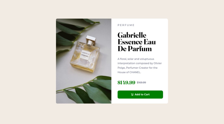
Here's a better way to manage the content of the text column and have the uniform space between the content you can use
justify-content: space-around;orgap: 24pxto separate each text..wrapper_right-side { display: flex; padding: 2rem; height: 100%; flex-direction: column; justify-content: space-around; }When you download the project files there’s a file called
style-guide.mdwhere you can find information such ashsl color codesand thefont-sizefor the headings. This way you'll have the correct color like thebuttonthat its a bit off, the correct color is:button { background-color: #3D8168; }👋 I hope this helps you and happy coding!
1@skarthikeyan96Posted about 2 years ago@correlucas Thanks Lucas for the feedback , will update them asap
1@correlucasPosted about 2 years ago@skarthikeyan96 than say me if was useful and if fixes your solution, keep it up👍
0
Please log in to post a comment
Log in with GitHubJoin our Discord community
Join thousands of Frontend Mentor community members taking the challenges, sharing resources, helping each other, and chatting about all things front-end!
Join our Discord
