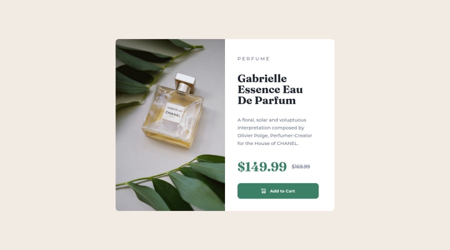
Design comparison
Community feedback
- @HassiaiPosted almost 2 years ago
To center the main on the page using flexbox, replace the height with min-height: 100vh.
There is no need to give the main height value, the padding value of .description is a responsive replace replacement of the height.
Use rem or em as unit for the padding, margin, width and preferably rem for the font-size for more on CSS units Click here
Hope am helpful.
Well done for completing this challenge. HAPPY CODING
Marked as helpful1 - @MelvinAguilarPosted almost 2 years ago
Hi there 👋. Good job on completing the challenge !
I have some feedback for you if you want to improve your code.
Your screenshot is distorted because you haven't reviewed your solution in other browsers like firefox.
A better way to create two columns is to use grid layout:
main { /* display: flex; */ min-height: 550px; max-width: 700px; color: hsl(212deg, 21%, 14%); display: grid; grid-template-columns: repeat(2, 1fr); } main .main-img { width: 100%; /* -o-object-fit: scale-down; */ /* object-fit: scale-down; */ /* -o-object-position: 50% 50%; */ /* object-position: 50% 50%; */ padding: 0; border-radius: 10px 0 0 10px; height: 100%; } @media (max-width: 730px) { main { /*flex-direction: column; */ max-width: 335px; grid-template-columns: 1fr; } }HTML:
- You could use the
<del>tag to indicate the price that was before the discount. Additionally, you can use asr-onlyclass to describe the discount. This will help screen reader users to understand that the price was discounted.
Example:
<del><span class="sr-only">Old price: </span>$169.99</del>- You can use the
<picture>tag when you have different versions of the same image. Using the<picture>tag will help you to load the correct image for the user's device saving bandwidth and improving performance. You can read more about this here.
Example:
<picture> <source media="(max-width: 730px)" srcset="./images/image-product-mobile.jpg"> <img src="./images/image-product-desktop.jpg" alt="{your alt text goes here}"> </picture>CSS:
- Instead of using pixels in font-size, use relative units like
emorrem. The font-size in absolute units like pixels does not scale with the user's browser settings. This can cause accessibility issues for users who have set their browser to use a larger font size. You can read more about this here.
- Use
min-height: 100vhinstead ofheight: 100vh. Theheightproperty will not work if the content of the page grows beyond the height of the viewport.
I hope you find it useful! 😄 Above all, the solution you submitted is great!
Happy coding!
Marked as helpful0@adex-hubPosted almost 2 years ago@MelvinAguilar Thanks for your very helpful comment, yeah I noticed that the image was distorted immediately I uploaded it, and I have fixed it now thanks for your suggestion. What you said about min-height, the <del> tag & the picture is also very useful I'd definitely implement it.
1 - You could use the
- @baynairaPosted almost 2 years ago
good job ,how do you add the 169.99 try using border radius for the picture plus what font family did you use you can check youtube on how to align
0@adex-hubPosted almost 2 years ago@baynaira for the 169.99 I used text-decoration: line-through; but there's a better way to do It according to the comment above yours
1
Please log in to post a comment
Log in with GitHubJoin our Discord community
Join thousands of Frontend Mentor community members taking the challenges, sharing resources, helping each other, and chatting about all things front-end!
Join our Discord
