Not Found
Not Found
Not Found
Not Found
Not Found
Not Found
Not Found
Not Found
Not Found
Not Found
Not Found
Not Found
Not Found
Not Found
Not Found
Not Found
Not Found
Not Found
Not Found
Not Found

Submitted

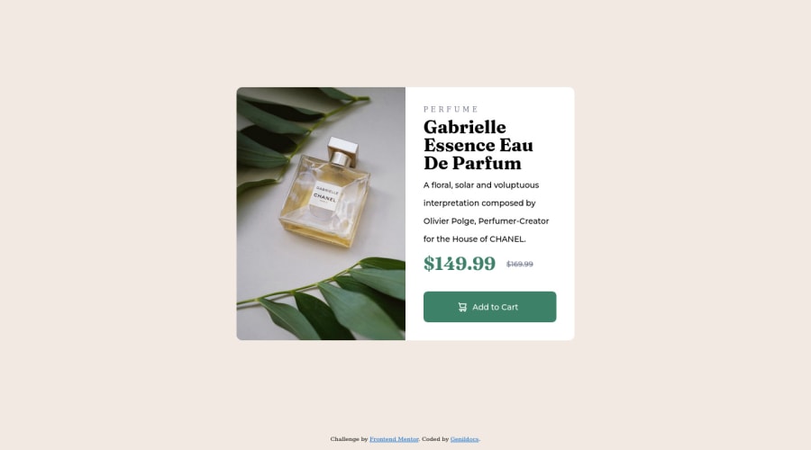
Responsive Product Preview Card using flex-box e position

@Genildocs

Desktop design screenshot for the Product preview card component coding challenge

This is a solution for...

  • HTML
  • CSS
1newbie
View challenge

Design comparison


SolutionDesign

Solution retrospective


To solve this challenge I used the flexbox properties to vertically align the items and position the relative and absolute properties to align the items in the center of the screen. I would like community feedback on what I can improve to make the site more responsive and less static.

Community feedback

@VCarames

Posted

Hey there! 👋 Welcome to FEM and congrats on completing your first challenge!🎊🍻

Here are some suggestions to help improve your code:

  • FEM Best practice ✅, before moving on to the next challenge, always check your FEM report (It provides value information), to see what is incorrect and update your code with it so that you would not make the same mistake over again. This should be the first thing that should be done ⚠️ right after submitting the challenge.
  • This <div class="container"> is unnecessary ⚠️.
  • The section element is being used incorrectly ⚠️ and not needed for this challenge .
  • Do not uppercase ❌ "perfume" in HTML as it is not accessible friendly. Instead you will want to style it in CSS.
  • The only heading ⚠️ in this component, is the name of the perfume; “Gabrielle Essence Eau De Parfum” . The rest of the text should be wrapped in a paragraph element.
  • ⚠️ Use `variables for your colors.
  • Implement a "Mobile First" approach 📱 > 🖥

Mobile devices are now the dominant 👑 way in which people browse the web, it is critical that your website/content looks perfect 💯 on all mobile devices.

More Info: 📚

Mobile First

If you have any questions or need further clarification, feel free to reach out to me.

Happy Coding! 🎆🎊🪅

Marked as helpful

0

@MelvinAguilar

Posted

Hello there 👋. Good job on completing the challenge !

I have some suggestions about your code that might interest you.

HTML 📄:

  • Use the <footer> tag to wrap the footer of the page instead of the <div class="attribution">. The <footer> element contains information about the author of the page, the copyright, and other legal information.

  • You can use the <picture> tag when you have different versions of the same image 🖼. Using the <picture> tag will help you to load the correct image for the user's device saving bandwidth and improving performance. You can read more about this here 📘.

    Example:

    <picture>
        <source media="(max-width: 640px)" srcset="./images/image-product-mobile.jpg">
        <img src="./images/image-product-desktop.jpg" alt="{your alt text goes here}">
    </picture>
    

CSS 🎨:

  • Remove the width and height of the body element, let it occupy 100% of the screen width. When you set a fixed width to the <body> element, it will only work well when the viewport has the same width, this means that the website will not adapt to the different screen sizes, and will look bad when it is accessed on a smaller device.
  • Centering an element with position: absolute would make your element behave strangely on some screen sizes, "there's a chance the content will grow to overflow the parent". You can use Flexbox or Grid to center your element. You can read more about centering in CSS here 📘.
body {
    background: #F2EAE2;
    min-height: 100vh;
    /* position: relative; */
    /* width: 1440px; */
    /* height: 800px; */
    display: flex;
    align-items: center;
    justify-content: center;
    flex-direction: column;
}

.main-container {
    ...
    /* margin-left: 20px; */
    /* margin-top: 20px; */
}

.container {
    /* position: absolute; */
    /* left: 420px; */
    /* top: 175px; */
}

I hope you find it useful! 😄 Above all, the solution you submitted is great!

Happy coding!

Marked as helpful

0

@Genildocs

Posted

@MelvinAguilar Thanks a lot for the feedback. I will make the changes you suggested.

0

Please log in to post a comment

Log in with GitHub
Discord logo

Join our Discord community

Join thousands of Frontend Mentor community members taking the challenges, sharing resources, helping each other, and chatting about all things front-end!

Join our Discord