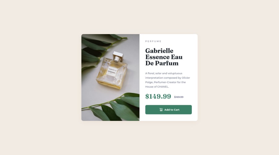
Product preview card component
Design comparison
Solution retrospective
Hello everyone!
I used visibility:hidden; and visibility:visible; to show the image on mobile and hide on desktop. Is there a better way of doing this?
And any feedback is welcome.
THANK YOU!
Community feedback
- Account deleted
Hi
For your image you should have used the <picture> element. It takes multiple images and allows you to decide which one to use depending on the conditions you set such as screen size. The background-image property is meant to be used for images that are just decorative and have nothing to do with the content.
Remove the <h3> as it is not necessary for the button text.
happy coding.
Marked as helpful1@SachithKarunathilakePosted almost 2 years ago@madzi-hove Thanks! It was helpful. I should try them next time.
0 - @i7ectorPosted almost 2 years ago
Good work @SachithKarunathilake!
regarding your question above, the way you did works as there is many ways to achieve the same result when it comes to coding.
things to consider...
display: none;
- removes the element from the page view
- code for the hidden element is still present
- element itself will not be displayed
- will not take up any space
.example-element {
  display: none;
}
visibility: hidden;
- removes the element from the page view
- element will still take up space on the page
.example-element {
  visibility: hidden;
}
hope this helps! good luck and happy coding :)
Marked as helpful1@SachithKarunathilakePosted almost 2 years ago@i7ector Thanks! It was helpful.
1@i7ectorPosted almost 2 years ago@SachithKarunathilake no problem glad you found it useful :)
1
Please log in to post a comment
Log in with GitHubJoin our Discord community
Join thousands of Frontend Mentor community members taking the challenges, sharing resources, helping each other, and chatting about all things front-end!
Join our Discord
