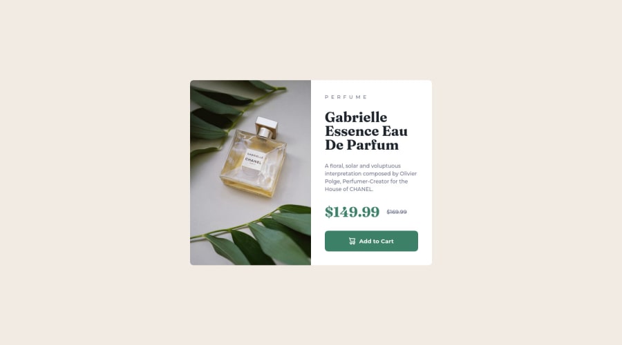
Design comparison
SolutionDesign
Community feedback
- @HassiaiPosted almost 2 years ago
Replace <div class="container"> with the main tag and <h2> with <h1> to fix the accessibility issues. for more on semantic html visit https://web.dev/learn/html/semantic-html/
Give .card-img img a max-width of 100% instead of a width and height of 100%. there is non need for background-size: cover in it.
Use the colors that were given in the styleguide.md. You forgot to add a media query for the mobile design.
Hope am helpful. Happy coding
Marked as helpful1
Please log in to post a comment
Log in with GitHubJoin our Discord community
Join thousands of Frontend Mentor community members taking the challenges, sharing resources, helping each other, and chatting about all things front-end!
Join our Discord
