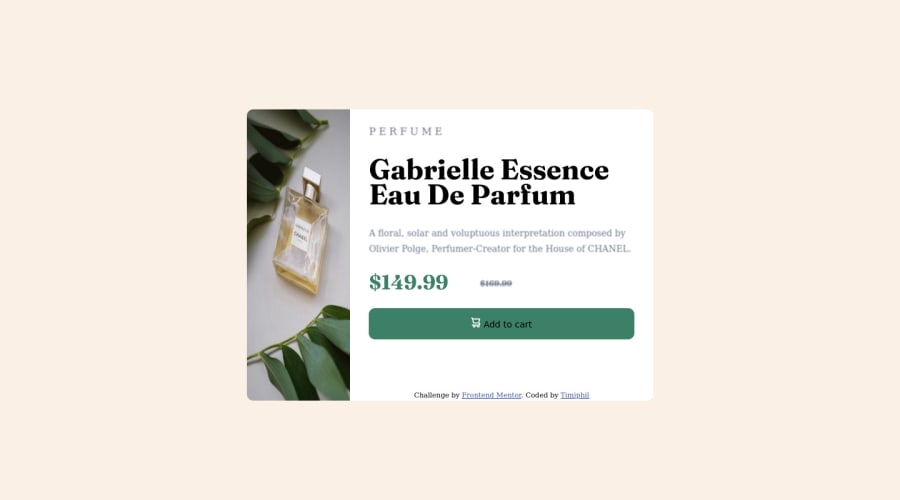
Design comparison
Solution retrospective
It was great, looking back 3months ago that i attempted this challenge. Learning continue. Happy Coding!
Community feedback
- @Nadine-GreenPosted almost 2 years ago
HEY ROTIMI!
I previewed your website and your solution is ok, but I have some tips I would like to give to improve it.
On your mobile design, you will need to use a different image, to be able to use different images for different width sizes, you will have to use the
picture
element, you can learn more about that here. You will also need to give yourimg
selector a width and height of 100%, this will prevent the image from breaking as it does in the mobile design.I also noticed that a hover effect was not include for the button i have done this challenge and i am pretty sure that a color for this effect was not given, what you will need to do is just give it a darker green, also change the
font-color
to white.HOPE I COULD BE OF HELP :)
HAPPY CODING!
0 - @orlando-caceresPosted almost 2 years ago
Good work! This was my first project a couple of days ago and the little I can help you is by telling you that the "Add to cart" button should change color when the pointer is over it, personally I did it in the following way:
.buy:hover { background-color: hsl(158, 36%, 25%); }
But surely there are other ways.
I hope it helps you a bit.
Very good work.
0
Please log in to post a comment
Log in with GitHubJoin our Discord community
Join thousands of Frontend Mentor community members taking the challenges, sharing resources, helping each other, and chatting about all things front-end!
Join our Discord