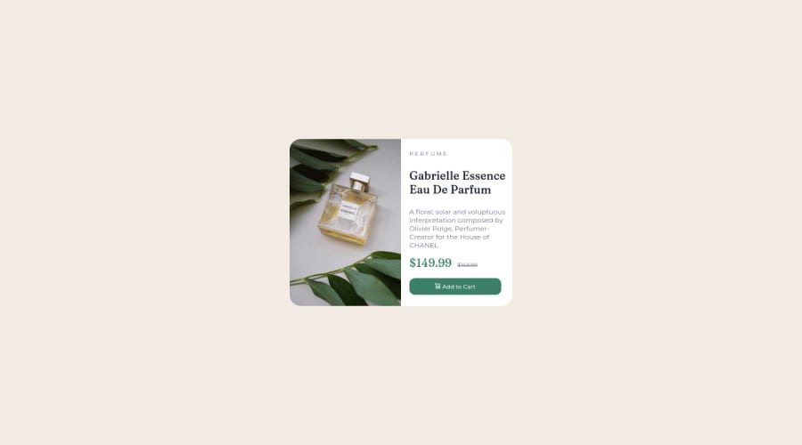
Product Preview Card Component using HTML5 and CSS3
Design comparison
Community feedback
- @HassiaiPosted almost 2 years ago
add the alt attribute
alt=" "to all the img tags, replace <p class="title"> with <h1> and wrap all the content in a main tag to fix the accessibility issue. the value for the alt is the description of the image. click here for more on web-accessibility and semantic htmlThere is no need to give the div a max-height value.
You forgot to add a media query for the mobile design.
To center a content on a page, add min-height:100vh; display: flex; align-items: center: justify-content: center; or min-height:100vh; display: grid place-items: center to the body.
To center the content on the page using flexbox:
body{
min-height: 100vh;
display: flex;
align-items: center;
justify-content: center;
}
To center the content on the page using grid: body{ min-height: 100vh; display: grid; place-items: center; }Use relative units like rem or em as unit for the padding, margin, width values and preferably rem for the font-size values, instead of using px which is an absolute unit. For more on CSS units Click here ' Hope am helpful.
Well done for completing this challenge. HAPPY CODING
Marked as helpful1
Please log in to post a comment
Log in with GitHubJoin our Discord community
Join thousands of Frontend Mentor community members taking the challenges, sharing resources, helping each other, and chatting about all things front-end!
Join our Discord
