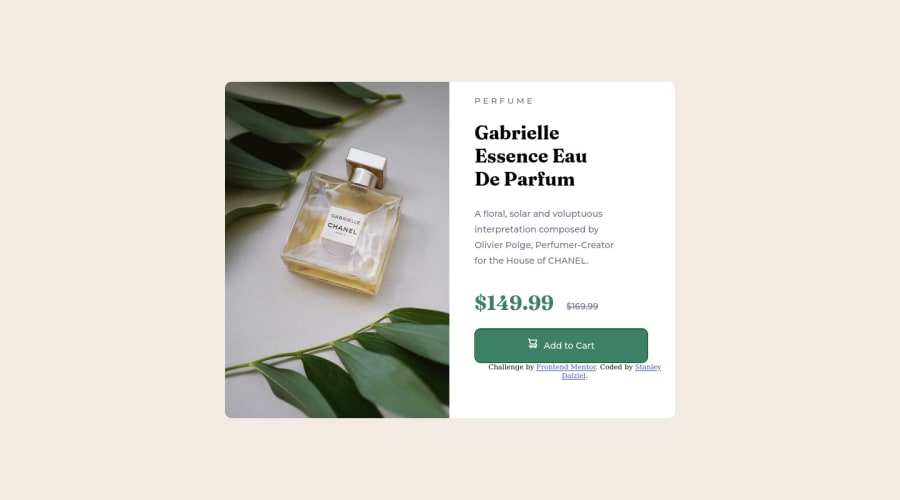


Design comparison

Community feedback
- @MelvinAguilarPosted almost 2 years ago
Hi there 👋. Good job on completing the challenge ! I have some feedback for you if you want to improve your code.
Currently there is no mobile view, you should use media query to modify some styles for mobiles :(
HTML:
- Use the
<main>tag to wrap all the main content of the page instead of the<div>tag. With this semantic element you can improve the accessibility of your page.
- Use the
<footer>tag to wrap the footer of the page instead of the<div class="attribution">. The<footer>element contains information about the author of the page, the copyright, and other legal information.
- The
<br>tag is not a semantic element. If a screen reader user is reading the page, they will hear "line break", which breaks the flow of the content. Instead, use CSS properties likemarginandpaddingto add vertical space between elements.
- You could use the
<del>tag to indicate the price that was before the discount. Additionally, you can use asr-onlyclass to describe the discount. This will help screen reader users to understand that the price was discounted.
Example:
<del><span class="sr-only">Old price: </span>$169.99</del>CSS:
- Setting a defined
heightfor the card component is not recommended. The content should define the component height, otherwise, it will not be allowed to extend beyond your specifications. Alternatively, you can usemin-height.
- Instead of using pixels in font-size, use relative units like
emorrem. The font-size in absolute units like pixels does not scale with the user's browser settings. This can cause accessibility issues for users who have set their browser to use a larger font size. You can read more about this here.
- You should use a CSS reset to remove the default browser styles and make your page look the same in all browsers.
Popular CSS resets:
I hope you find it useful! 😄 Above all, the solution you submitted is great!
Happy coding!
Marked as helpful1 - Use the
- @VictorResinesPosted almost 2 years ago
Hi @stanleydalziel! 👋🏻
Good to see you here completing more challenges!
Answering to your question: "Is there a way to adjust the vertical spacing between items in flex-box column"
I think the property you are looking for is gap and you need to add it in the flexbox container, the value could be specified in pixels. That will set the spacing between the items of your flexbox.
You can refer to this article
Hope you find it helpful, i am here if you have any further questions! 🙂 Happy coding =)
Marked as helpful0@stanleydalzielPosted almost 2 years ago@VFull Awesome thank you for this I was having a headache trying to find this online.
0


Please log in to post a comment
Log in with GitHub
Join our Discord community
Join thousands of Frontend Mentor community members taking the challenges, sharing resources, helping each other, and chatting about all things front-end!
Join our Discord