Submitted over 2 years ago
Product preview card component
#accessibility#lighthouse
P
@andreasremdt
Design comparison
SolutionDesign
Solution retrospective
Hey there,
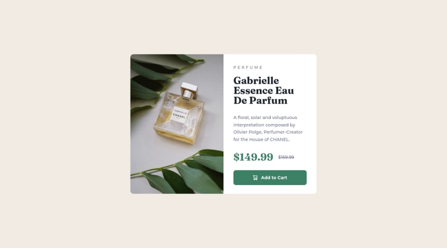
This is my solution to the product preview card component. My goal was to make the markup as accessible as possible and the design as close to Figma as possible.
The HTML is enhanced by (schema.org)[https://schema.org/], marking the container as a product with appropriate properties, such as name, price, and category. The image is responsive and loads depending on the viewport's size, thanks to srcset and sizes.
Stylewise, the challenge was built mobile-first, introducing a single media query to break the layout for better desktop support. Let me know what you think :)
Community feedback
Please log in to post a comment
Log in with GitHubJoin our Discord community
Join thousands of Frontend Mentor community members taking the challenges, sharing resources, helping each other, and chatting about all things front-end!
Join our Discord
