colorhint for color, and some of css and icons from google and nth els


Design comparison

Solution retrospective
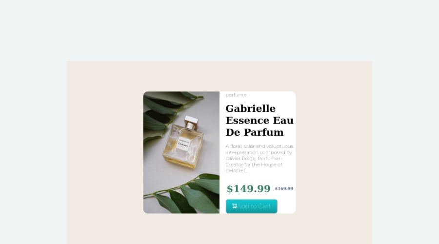
hai focks first off all I wana say this one is my first project and I know its not at all perfect.....give me some feedback how can I improve it.....and I didn't able to make it responsive give me some suggestions to improve it........
Community feedback
- @danielemanca1983Posted almost 2 years ago
Hey there,
I will be providing you some guidance on how to improve the solution you submitted, however I would suggest that, not only you look into flexbox in terms of positioning elements on a page, but also review HTML, specifically headings 1 to 6, as headings should not be skipped, let's say for instance as on your solution, from 1 all the way down to 6.
I will be touching on the mark-up code first and then move onto the CSS.
HTML
-
Your code contains two containing <div>s, one only is sufficient, and I would suggest to take a look at the <main> tag as well, which in modern web development we can wrap content into, see its usage on this MDN Link
-
So to recap briefly from the above, you could have: main followed by the card component, no other containers.
-
As already mentioned by someone else the <h1> does not need to be split in 3, one tag is sufficient and the text will wrap by itself
-
Also, as someone already mentioned, in order to position the discounted price and the original price, you could look into flexbox, for instance you can have a heading <h2> in there with a <span> for the smaller text, display the heading as flex and then align-items: center to vertically center the smaller text with the larger one.
-
The mark-up code for the <button> element is good.
Now the CSS
-
I think that, again in terms of flexbox, you can position the component vertically and horizontally centered on the page, by using the flexbox properties or also grid, they both do a great job at doing this.
-
Using the float property requires the element coming right after to be cleared, with the clear property. However if you used flexbox or grid that would not be necessary at all.
-
I would suggest not to assign a fixed width and height to the img, it kills it from being responsive at all, instead give it a max-width.
-
The .btn CSS rule contains properties which are not required based on the given design for the component. For instance the <button> in the design only makes use of a bold green background color, no border, for which you can use the border: none; CSS property, and then apply all other properties to the button to style it as per the provided design.
-
The component on the mobile design displays the content in a vertical fashion, one potential way of achieving that, is to use flexbox on the component to make its children flex items and then use the flex-direction property for smaller viewports to display the content as a column.
Marked as helpful1 -
- @chrizgxPosted almost 2 years ago
Hello, and congrats on submitting your first project! I took a look at your code, and there's my feedback for you.
1] In general, I would recommend you study CSS flexbox. It is the most efficient way to position items throughout the whole page. (take a look here: https://css-tricks.com/snippets/css/a-guide-to-flexbox/). After you understand the concept, you can take a look at my solution too (where I use flexbox). Here is my link to my github repo: https://github.com/chrizgx/frontendmentor-product-preview-card-component/
2] I can see you spread the title 'gabrielle essence eau . . .' by using 3 header elements. Instead, you can use just 1, and the text will wrap automatically.
3] Using a table to position the deleted price right next to the current price is smart. However, it is not recommended to include headers items inside a table. You don't need to worry, though. Once you learn flexbox, you can recreate it without using a table.
4] As for the button, the html part is correct. About CSS, I recommend always setting 'border: none;' for buttons, because browsers apply a border by default (which I personally don't like).
If you want my opinion, the most critical thing to focus on is css flexbox. It is simpler than it might seem in the beginning, and it is very useful. Have fun coding and exploring new stuff. Feel free to ask questions, I am happy to help.
Marked as helpful1 - @catherineisonlinePosted almost 2 years ago
Hey there, nice solution! If you want to improve your code, make sure sure to use footer tag for your attribution div.
You can read more about semantic html here: https://www.w3schools.com/html/html5_semantic_elements.asp
IF THIS WAS HELPFUL PLEASE MARK IT AS HELPFUL 🤩
1@ervishwaPosted almost 2 years ago@catherineisonline thnks a lot for ur priciest time...
0


Please log in to post a comment
Log in with GitHub
Join our Discord community
Join thousands of Frontend Mentor community members taking the challenges, sharing resources, helping each other, and chatting about all things front-end!
Join our Discord