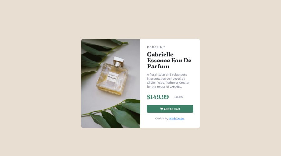
Product preview card component using CSS and HTML
Design comparison
Solution retrospective
I had confused when the first time I do the responsive section. But finally, everything is okey! thanks
Please log in to post a comment
Log in with GitHubCommunity feedback
- Account deleted
Hey there! 👋 Here are some suggestions to help improve your code:
- Do not uppercase ❌ "perfume" in HTML as it is not accessible friendly. Instead you will want to style it in CSS.
- The only heading ⚠️ in this component, is the name of the perfume; “Gabrielle Essence Eau De Parfum” . The rest of the text should be wrapped in a
paragraphelement.
- Implement a "Mobile First" approach 📱 > 🖥
Mobile devices are now the dominant 👑 way in which people browse the web, it is critical that your website/content looks perfect on all mobile devices.
More Info: 📚
If you have any questions or need further clarification, feel free to reach out to me.
Happy Coding! 🎆🎊🪅
Marked as helpful - @MelvinAguilar
Hello there 👋. Good job on completing the challenge !
I have some feedback for you if you want to improve your code.
HTML 📄:
- Use the
<main>tag to wrap all the main content of the page instead of the<div>tag. With this semantic element you can improve the accessibility of your page.
-
You could use the
<del>tag to indicate the price that was before the discount. Additionally, you can use asr-onlyclass to describe the discount. This will help screen reader users to understand that the price was discounted.Example:
<del><span class="sr-only">Old price: </span>$169.99</del>
-
You can use the
<picture>tag when you have different versions of the same image 🖼. Using the<picture>tag will help you to load the correct image for the user's device saving bandwidth and improving performance. You can read more about this here 📘.Example:
<picture>
    <source media="(max-width: 460px)" srcset="./images/image-product-mobile.jpg">
    <img src="./images/image-product-desktop.jpg" alt="{your alt text goes here}">
</picture>
CSS 🎨:
- To center the component in the page, you should use Flexbox or Grid layout. You can read more about centering in CSS here 📘.
I hope you find it useful! 😄 Above all, the solution you submitted is great!
Happy coding!
Marked as helpful - Use the
Join our Discord community
Join thousands of Frontend Mentor community members taking the challenges, sharing resources, helping each other, and chatting about all things front-end!
Join our Discord
