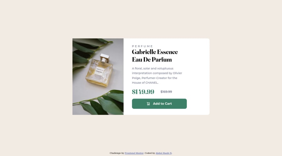
Design comparison
Solution retrospective
I would appreciate getting some feedback on the structure of the page, the way the HTML is written. Any directions towards a source to learn semantic HTML and accessibility is much appreciated.
Community feedback
- @DavidMorgadePosted about 2 years ago
Hello Abdul, congrats on finishing the challenge!
In the case of this project you can use the general structure of a basic html file to get the best semantics, it can be something like this:
<main> /* Your whole component goes in this tag */ <section> /* Your image goes here */ <picture> /* Here goes your image, a picture tag so you can put both images, and display it depending on the width of the screen */ <source> <source> </picture> </section> <section> /* here goes the right part of the component or the bottom on mobile */ <p></p> <h1></h1> <p></p> <div> <h2></h2> <span></span> </div> <button></button> </section> <footer></footer> /* The attribution goes here */ </main>
This can be an example of a semantic html structure for your component! it doesn't have to be 100% the same but you can get the idea!
Also there is some kind of problem with your text because you have too much image width, try reducing it to less than half of the component width so the text can fit correctly in the box!
Hope my feedback helps you in future challenges, good job!
Marked as helpful0@abdulhasibnPosted about 2 years ago@DavidMorgade Thanks for taking time to give me feedback. Regarding that text not fitting inside the component, I don't see it protruding out of the div in my live page, whereas in the solution- design comparison it is so. Do you know what's the reason for that?
1@DavidMorgadePosted about 2 years ago@abdulhasibn I see it actually overlapping out on your live page, maybe you did change it after uploading but you didn't generate a screenshot of it again?
Try adding this on your CSS and generate a screenshot again after updating your live projects:
@media only screen and (min-width: 900px) { .pic { max-width: 40% } .texts__hero { align-self: center; margin: 0 auto; } }
With this your component will look like the challenge at desktop sizes, for mobile you don't have to change anything, thats why I added a media querie.
If you have anymore questions don't hesitate to ask.
0@abdulhasibnPosted about 2 years ago@DavidMorgade I tried what you've said, but it's misbehaving in my screen it seems. https://github.com/abdulhasibn/Product_preiview_card_component
This is my repository, where you can see, how my component was before I edited the code the way you asked me to do. After I did it, the texts_hero part has moved to the left a bit , thereby overlapping the image.
However, the generated screenshot has got fine. Totally confused.
Thanks for your help. Much appreciated.
0@DavidMorgadePosted about 2 years ago@abdulhasibn The problem is that your
img
is getting more width than yourclass='pic'
container, I made a pull request to your repo, try it to see how it looks!Marked as helpful1@abdulhasibnPosted about 2 years ago@DavidMorgade Thank you so much mate. That was really helpful.
1
Please log in to post a comment
Log in with GitHubJoin our Discord community
Join thousands of Frontend Mentor community members taking the challenges, sharing resources, helping each other, and chatting about all things front-end!
Join our Discord