Not Found
Not Found
Not Found
Not Found
Not Found
Not Found
Not Found
Not Found
Not Found
Not Found
Not Found
Not Found
Not Found
Not Found
Not Found
Not Found
Not Found
Not Found
Not Found
Not Found

Submitted

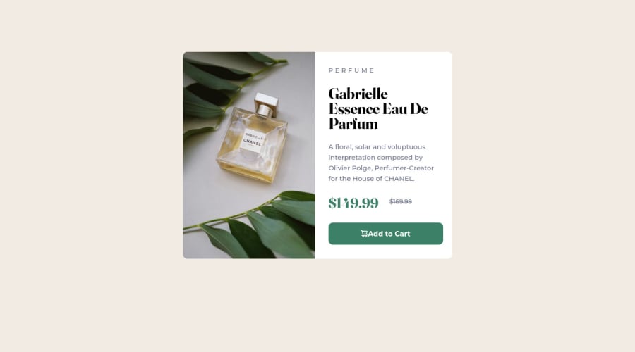
Product Preview Card Component built using HTML & CSS

Kevin Tatagibaā€¢ 270

@kevintata

Desktop design screenshot for the Product preview card component coding challenge

This is a solution for...

  • HTML
  • CSS
1newbie
View challenge

Design comparison


SolutionDesign

Solution retrospective


šŸ‘Øā€šŸ’» Hey, I'm Kevin! A Junior Front End Web Dev Looking for work!

šŸ‘Øā€šŸ’» This is my solution for the Frontend Mentor Product Preview Card Component!

Let me know what you guys think!

Community feedback

MURRAY122ā€¢ 280

@MURRAY122

Posted

Hi Kevin Tatagiba,

Congrats on the challenge, I seen some of your code and think this could help.

  • Your html needs landmarks which help with accessibility.
  • Instead of using position: relative on your picture and div elements and setting their fixed positions like top, you could try wrapping your picture and div box within <main></main> and then following could style them
body{
   height:100vh; //add to your body styles
   margin: 0; // add to your body styles
}
main{
   display: flex;
   flex-direction: row;
}

This could then center your main element to the center of the screen.

0

Kevin Tatagibaā€¢ 270

@kevintata

Posted

@MURRAY122 Hey Murray,

Thank you so much for the feedback, I really appreciate it!

Im trying to do it right now but it doesnt seem to work, could you check this for me?

body{
    display: flex;
    justify-content: center;
    align-items: center;
    background: hsl(217, 54%, 11%);
    font-family: 'Outfit', sans-serif;
    height: 100vh;
    margin: 0;
}

main {
    display: flex;
    flex-direction: row;
}
#box{
    width: 300px;
    height: 500px;
    background: hsl(216, 50%, 16%);
    border-radius: 10px;
}
0
MURRAY122ā€¢ 280

@MURRAY122

Posted

Hi @kevintata,

seems fine for the most part but just to make sure try the following.

ensure the main tag is wrapping your picture and div tags like so:

<main>
<picture></picture>
<div id='box'></div>
</main>

then try this for the styles:

body{
    display: flex;
    justify-content: center;
    align-items: center;
    background: hsl(30, 38%, 92%);
    font-family: 'Outfit', sans-serif;
    height: 100vh;
    margin: 0;
}

main{
    display: flex;
    flex-direction: row; 
    /* row only for desktop views | column for mobile */
}

box{
    width: 300px;
    padding: 30px;
    background: hsl(0, 0%, 100%);
    border-radius: 10px;
}

Then of course after that, remove the postion: relative on your img tag and its more about changing font sizes and margins etc for your text areas etc... if needed.

0

Please log in to post a comment

Log in with GitHub
Discord logo

Join our Discord community

Join thousands of Frontend Mentor community members taking the challenges, sharing resources, helping each other, and chatting about all things front-end!

Join our Discord