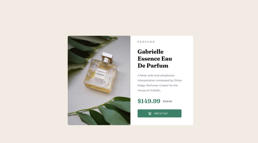
Design comparison
Community feedback
- @malek-btPosted almost 2 years ago
Hey !, how are you ? I really liked the result of your project, but I have some tips that I think you will enjoy:
1.Usually, separation of CSS from HTML means putting all CSS rules into separate file. Ideally, HTML should not contain any CSS styles, rules or style attributes. Separation is necessary for readability and maintainability. It's definitely easier to just open the file that contains CSS rules instead of searching style attributes in huge HTML file.
2.Use the <main class="product"> tag to wrap all the main content in your solution instead of using <div class="product">.
3.The <img> alt attribute is used to specify the alternate text for an image. It is useful when the image is not displayed. It is used to give alternative information for an image.So make sure to make it not empty.
4.Use <footer> instead of <div class="attribution">. The <footer> element contains authorship information. Once you update the container <div class="attribution">, the footer should be outside the main content.
5.Instead of using pixels in font size, use relative units of measure like rem or em. The font size in absolute length units (px) does not allow users with limited vision to change the text size in some browsers.
6..I see your README file is MAL structured. README is a very important aspect of making projects, especially if you want other people to see it. You should read the README file and the README-template file to make nice one.
The rest is good, I hope those tips will help you! 👍
Good job!
Marked as helpful1@KrisclinosPosted almost 2 years ago@malek-bt Thank you very much for your constructive feedback! :)
1
Please log in to post a comment
Log in with GitHubJoin our Discord community
Join thousands of Frontend Mentor community members taking the challenges, sharing resources, helping each other, and chatting about all things front-end!
Join our Discord
