

Design comparison

Solution retrospective
feedback is welcome!
Community feedback
- @MelvinAguilarPosted about 2 years ago
Hello there 👋. Good job on completing the challenge !
I have some suggestions about your code that might interest you.
HTML 📄:
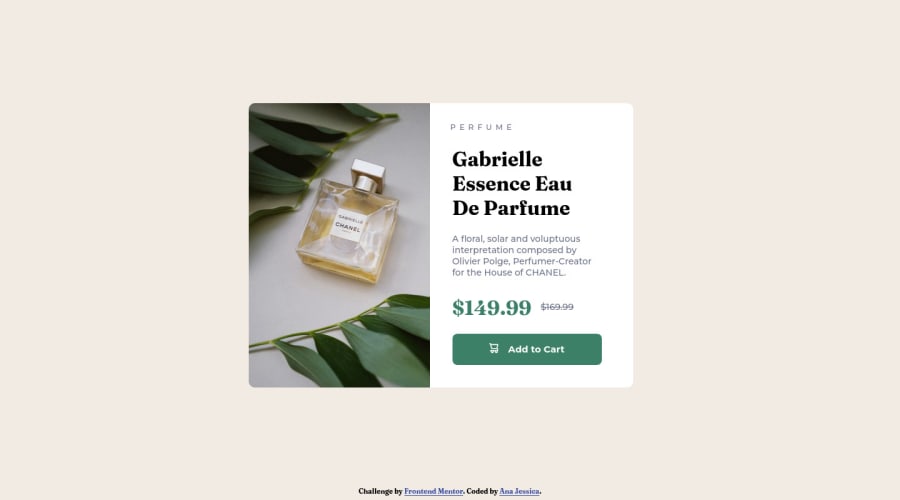
- The product image is not a decoration. You must not use the background-image property to add the product image. Instead, use the
<img>tag to add the image. Use the background-image property only for decorative images that do not add any information to the page.
-
You can use the
<picture>tag when you have different versions of the same image 🖼. Using the<picture>tag will help you to load the correct image for the user's device saving bandwidth and improving performance. You can read more about this here 📘.Example:
<picture>
    <source media="(max-width: 992px)" srcset="./images/image-product-mobile.jpg">
    <img src="./images/image-product-desktop.jpg" alt="{your alt text goes here}">
</picture>
- Avoid using uppercase text in your HTML because screen readers will read it letter by letter. You can use the
text-transformproperty to transform the text to uppercase in CSS.
-
You could use the
<del>tag to indicate the price that was before the discount. Additionally, you can use asr-onlyclass to describe the discount. This will help screen reader users to understand that the price was discounted.Example:
<del><span class="sr-only">Old price: </span>$169.99</del>
CSS 🎨:
- Instead of using pixels in font-size, use relative units like
emorrem. The font-size in absolute units like pixels does not scale with the user's browser settings. This can cause accessibility issues for users who have set their browser to use a larger font size. You can read more about this here 📘.
- You should use the
box-sizing: border-boxproperty to make thewidthandheightproperties include the padding and border of the element. This will make it easier to calculate the size of an element. You can read more about this here 📘.
- Use
min-height: 98vhinstead ofheight: 98vh. Theheightproperty will not work if the content of the page grows beyond the height of the viewport.
I hope you find it useful! 😄 Above all, the solution you submitted is great!
Happy coding!
Marked as helpful3 - The product image is not a decoration. You must not use the background-image property to add the product image. Instead, use the
- @HassiaiPosted about 2 years ago
Add the alt attribute
alt=" "to the img tag to fix the error issue.To center the main on the page, add min-height:100vh; display: flex; align-items: center: justify-content: center; or min-height:100vh; display: grid place-items: center to the body.
To center  the main on the page using flexbox:
body{
min-height: 100vh;
display: flex;
align-items: center;
justify-content: center;
}
To center the main on the page using grid: body{ min-height: 100vh; display: grid; place-items: center; }Hope am helpful.
Well done for completing this challenge. HAPPY CODING
Marked as helpful1 - @Candido-HMPosted about 2 years ago
Muchas felicidades por el reto realizado.
1


Please log in to post a comment
Log in with GitHub
Join our Discord community
Join thousands of Frontend Mentor community members taking the challenges, sharing resources, helping each other, and chatting about all things front-end!
Join our Discord