Design comparison
Community feedback
- @thibault-devergePosted about 1 month ago
Project Feedback
Hi rajaab,
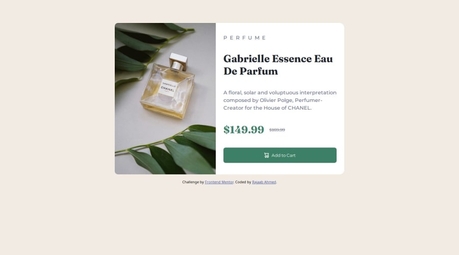
Great job on your project! I enjoyed reviewing your code and the overall design. Here are a few suggestions that might help enhance your work. Overall that's really good with use of flexbox, relative unit and not too long css. Well done !
About the visual, I would say:
-
Card Width and Centering vertically
- The card feels a bit too wide and isn't fully centered vertically. You can maybe use Flexbox on the
<body>to center the card both horizontally and vertically. Additionally, applyingmax-widthandmin-widthinstead of a fixedwidthallows the content to scale more naturally across different screen sizes. You can see on mobile devices like the iPhone 12 Pro, the card isn't centered vertically.
- The card feels a bit too wide and isn't fully centered vertically. You can maybe use Flexbox on the
-
Equal Distribution Between Image and Content
- The image and content sections should each take up 50% of the card, but currently, the content appears slightly larger. Ensure both
.product-card__imageand.product-card__contenthave equal flex properties to maintain a balanced layout.
- The image and content sections should each take up 50% of the card, but currently, the content appears slightly larger. Ensure both
-
Breakpoint Adjustment for Responsive Layout The breakpoint for switching to the desktop layout might be set too high, potentially causing issues on devices like the iPad Mini in landscape mode. Consider lowering the breakpoint to ensure a smoother transition from column to row layouts across various devices.
About the code :
-
Reducing Unnecessary
<div>Elements- There are multiple
<div>elements wrapping around<p>and<h1>tags.Since<p>and<h1>are block-level elements by default, you can style them directly without additional<div>wrappers. This simplifies your HTML and makes it more semantic.
- There are multiple
-
Optimizing Image Loading with
<picture>Element Having two<img>elements for different viewport sizes can lead to both images being loaded, affecting performance. Use the<picture>element to allow the browser to choose the appropriate image based on the viewport size. This ensures only the necessary image is loaded, improving load times. It also improve your life as you don't need to display: none in your css, it is handled automatically.- Example:
<picture class="product-card__image">
  <source media="(min-width: 800px)" srcset="./images/image-product-desktop.jpg">
  <img src="./images/image-product-mobile.jpg" alt="Product's photo">
</picture>
- Example:
Here, the browser will choose the desktop image if the min-width is more than 800px but fallback to the mobile image if it not the case for example.
- Implementing CSS Reset and Naming Conventions Incorporate a CSS reset to ensure consistency across different browsers. Additionally, adopting a naming convention like BEM can improve the readability and maintainability of your CSS. BEM Methodology This advice is quite personal, but could be nice to research about it and see if you want to implement in future project.
Keep up the great work, and feel free to reach out if you need any more tips or assistance! Happy coding :)
0 -
Please log in to post a comment
Log in with GitHubJoin our Discord community
Join thousands of Frontend Mentor community members taking the challenges, sharing resources, helping each other, and chatting about all things front-end!
Join our Discord
