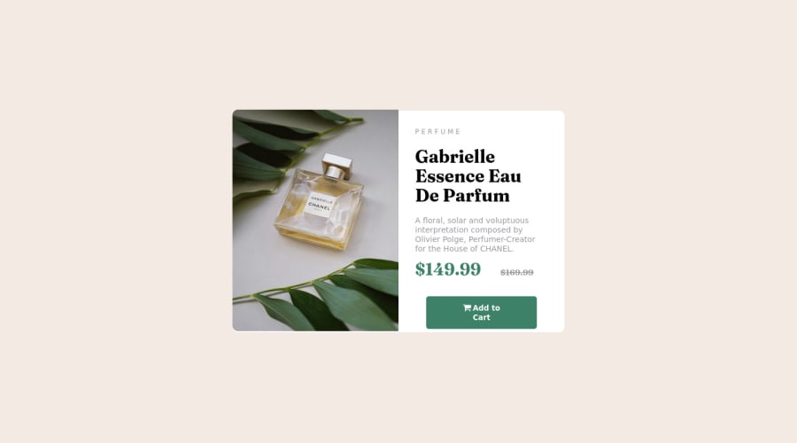


Design comparison
SolutionDesign

Solution retrospective
Please give your valuable feedbacks. I was stuck on project to make image and text part to make it in half of the screen. tell me how can i make it easily. And also the alignment is not proper so please also let me know your suggestions to correct it
Community feedback
- @rafdidactPosted almost 2 years ago
Hey, Kartik!
I got a few suggestions that would make your code even better:
- Your layout should be responsive. This means the components of your design should be properly reorganized depending on the width of the device your viewing it from. When I switch to mobile view, your design stays the same. You can make your CSS automatically apply new styles depending on the width of the device your viewing it from with a
@mediarule. - Your button should take all the width available and change cursor to pointer when hovering. You can achieve this with a
width: 100%and acursor: pointer.
You can check my solution for reference. Hope it helps.
2 - Your layout should be responsive. This means the components of your design should be properly reorganized depending on the width of the device your viewing it from. When I switch to mobile view, your design stays the same. You can make your CSS automatically apply new styles depending on the width of the device your viewing it from with a
- @chicaboom-73Posted almost 2 years ago
Hi Kartik
There is a great video on youtube that may answer a few questions for you. It goes through the CSS and HTML for this challenge
https://www.youtube.com/watch?v=B2WL6KkqhLQ
1


Please log in to post a comment
Log in with GitHub
Join our Discord community
Join thousands of Frontend Mentor community members taking the challenges, sharing resources, helping each other, and chatting about all things front-end!
Join our Discord