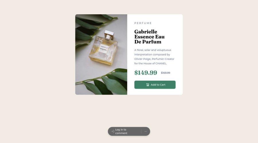
Design comparison
Community feedback
- @OpenWorldProjectOWPPosted over 2 years ago
Hey Bruno, great job with this challenge! I just completed this one myself and something I learned that I think is a good takeaway for you as well was: Use the "main" section as a container itself and by giving it the property "flex" you can then center the "container" div which places everything nicely in the middle of the page. That small change has a huge impact on the finished projects appearance. Feel free to view mine and leave me feedback. I left mine unedited so that I can continue to receive advice on the original attempt.
0@bvictor-aPosted over 2 years agoThank you for your feedback @OpenWorldProjectOWP. In a way, I did something similar to your tip, after sending the solution, I modified the "main" element so that all its content was inside a the "container".
0
Please log in to post a comment
Log in with GitHubJoin our Discord community
Join thousands of Frontend Mentor community members taking the challenges, sharing resources, helping each other, and chatting about all things front-end!
Join our Discord
