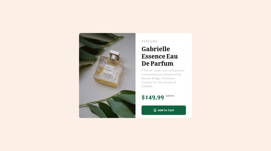
Product review card for desktop and mobile view (html, css, flexbox)
Design comparison
Solution retrospective
My first ever project submitted. I would like to hear any possible feedback on the structure of my HTML file. Did I structure my divs, containers, child and parent elements properly, or are there any tips for improvement or is there a better way of doing it? Thank you.
Community feedback
- @MelvinAguilarPosted almost 2 years ago
Hi there ๐. Good job on completing the challenge !
I have some feedback for you if you want to improve your code.
HTML:
- Use the
<main>
tag to wrap all the main content of the page instead of the<div class="container">
tag. With this semantic element you can improve the accessibility of your page.
- You could use the
<del>
tag to indicate the price that was before the discount. Additionally, you can use asr-only
class to describe the discount. This will help screen reader users to understand that the price was discounted.
Example:
<del><span class="sr-only">Old price: </span>$169.99</del>
- You can use the
<picture>
tag when you have different versions of the same image. Using the<picture>
tag will help you to load the correct image for the user's device saving bandwidth and improving performance. You can read more about this here.
Example:
<picture> <source media="(max-width: 480px)" srcset="./images/image-product-mobile.jpg"> <img src="./images/image-product-desktop.jpg" alt="{your alt text goes here}"> </picture>
Alt text:
- The
alt
attribute should not contain the words "image", "photo", or "picture", because the image tag already conveys that information.
- Not all images should have alt text. The cart-icon is a decorative image, it does not add any information to the page. You should use an empty
alt
attribute instead of a descriptive one. You can read more about this here.
If you want to learn more about the
alt
attribute, you can read this article.CSS:
- Instead of using pixels in font-size, use relative units like
em
orrem
. The font-size in absolute units like pixels does not scale with the user's browser settings. This can cause accessibility issues for users who have set their browser to use a larger font size. You can read more about this here.
- You should use the
cursor: pointer
property to indicate that the element like a button or a link is clickable.
Please don't worry if your suggestions are long, they are just details. In the end, the project is well done ๐. Hope you find those tips helpful! ๐
Happy coding!
Marked as helpful1@zuzanapiarovaPosted almost 2 years ago@MelvinAguilar This is my first feedback ever so thank you for all the tips! I will read through the references and start implementing your advice in my practice.
0 - Use the
Please log in to post a comment
Log in with GitHubJoin our Discord community
Join thousands of Frontend Mentor community members taking the challenges, sharing resources, helping each other, and chatting about all things front-end!
Join our Discord