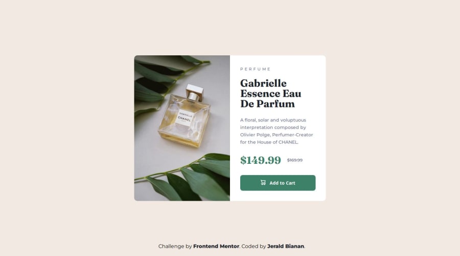


Design comparison

Solution retrospective
I think I am very close to the design.
What challenges did you encounter, and how did you overcome them?tried my best to make it pixel perfect.
What specific areas of your project would you like help with?To all experts out there, If you have the time to check on this solution, please let me know if I am following best practice, Semantic HTML, Accessibility and so on. All feedback are appreciated.
Community feedback
- @AdrianoEscarabotePosted 4 months ago
Hi Jerald Bianan, how are you doing? I really loved the outcome of your project, but I have a few suggestions that I think might be helpful:
Use the THE PICTURE TAG that is a shortcut to deal with the multiple images in this challenge. So you can use the
<picture>tag instead of importing this as an<img>or using a div withbackground-image. Use it to place the images and make the change between mobile and desktop, instead of using adivorimgand set the change in the css withdisplay: nonewith the tag picture is more practical and easy. Note that for SEO / search engine reasons isn’t a better practice import this product image with CSS since this will make it harder to the image. Manage both images inside the<picture>tag and use the html to code to set when the images should change setting the devicemax-widthdepending of the device desktop + mobile.Check the link for the official documentation for <picture> in W3 SCHOOLS: https://www.w3schools.com/tags/tag_picture.asp
See the example below:
<picture>
  <source media="(max-width:650px)" srcset="./images/image-product-mobile.jpg">
  <img src="./images/image-product-desktop.jpg" alt="Gabrielle Parfum" style="width:auto;">
</picture>
The rest is excellent.
I hope you find it useful. 👍
Marked as helpful0P@jeraldbiananPosted 4 months ago@AdrianoEscarabote Thank you for this wonderful suggestion.
1 - @Dadv-a11yPosted 4 months ago
the layout is not well display on different range of screen on my laptop the layout is display as on a mobile
Marked as helpful0P@jeraldbiananPosted 4 months ago@Dadv-a11y Ahh I see, I used mobile first approach, and in the figma design there is no design for tablet(768px), only for mobile and desktop which is 1440px. Thank you for this, appreciate it.
I think I will have to consider the tablet view, once the tablet view is reached the desktop design will be viewed, because it looks like your laptop resolution is below 1440px.
0


Please log in to post a comment
Log in with GitHub
Join our Discord community
Join thousands of Frontend Mentor community members taking the challenges, sharing resources, helping each other, and chatting about all things front-end!
Join our Discord