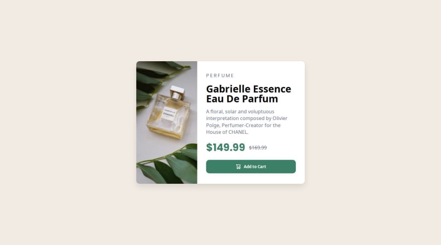
Product Preview Card Component - HTML & CSS


Design comparison

Solution retrospective
I'm proud of successfully completing this challenge and making the design fully responsive. Next time, I would focus more on improving my CSS skills, especially using Grid and Flexbox more efficiently.
What challenges did you encounter, and how did you overcome them?One challenge I faced was making the layout responsive for different screen sizes. I solved it by using CSS Flexbox and media queries.
What specific areas of your project would you like help with?I would love feedback on how I can improve my CSS structure and make my code cleaner. Also, any tips on better responsiveness techniques would be helpful.
Community feedback
- @kunal90803Posted 4 days ago
Great work, @asia272
I noticed one small improvement that could enhance your design further. For a more refined typography, consider using 'Fraunces', serif for bold headings and the price (149.99), while keeping 'Montserrat', sans-serif for the description.
Other than that, you've created a beautiful design. Keep up the great work!
Happy coding! 😊
Marked as helpful1 - @BlackpachamamePosted 18 days ago
Hey your solution is amazing! 🤩
📌 Some accessibility and semantics recommendations for your HTML
- To improve the semantics of your HTML, you can change your
<div class="container">to a<main class="container"> - Use
min-heightandmax-width, this will help the content stretch or shrink if you need to. Unlikeheightandwidthwhich can cause your content to be cut off on certain screens. For example, usemin-height: 100vhinstead ofheight: 100vh - The
width: 100vwproperty is unnecessary, It can also generate a horizontal scroll - You can use the
<picture>tag to change the image according to the screen size. More info - You can apply
display: blockto the image to remove the white space generated underneath. Although visually in this case it is irrelevant, it helps you better calculate the space with other elements
Marked as helpful1@asia272Posted 16 days agoHey @Blackpachamame, thank you for your feedback! I have updated my code by incorporating all your suggestions.
- I’ve changed the container to a
<main>element for better semantics. - I used responsive properties (
min-height,max-width,width: 100%) to ensure the layout adjusts properly. - I implemented a
<picture>element with proper responsive image handling. - The image now fills the height of the container as expected using
object-fit: coverand properheight/widthsettings.
I really appreciate your insights, and these changes have greatly improved the responsiveness and accessibility of my design!
1 - To improve the semantics of your HTML, you can change your
- @kuldeepchouhan-hubPosted 16 days ago
you have done excellent work, i am impressed.
0@asia272Posted 16 days agoThank you! kuldeep chouhan. Your feedback encourages me to keep learning and improving
0 - @muhammadawaislaalPosted 16 days ago
its looking so pretty i appriciate your hard work
0@asia272Posted 16 days agoI truly appreciate your kind words! It motivates me to keep improving and creating better experiences. Thank you!
0@muhammadawaislaalPosted 16 days ago@asia272 thanks so mark my comments as helpful and follow me
0


Please log in to post a comment
Log in with GitHub
Join our Discord community
Join thousands of Frontend Mentor community members taking the challenges, sharing resources, helping each other, and chatting about all things front-end!
Join our Discord