Submitted about 2 years ago
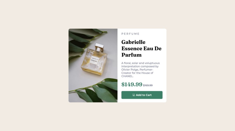
Product preview card challenge web use CSS Flex box
@Kiet-Workspace
Design comparison
SolutionDesign
Solution retrospective
Please give me suggestions to continue to develop skills. Thanks a lot
Community feedback
- @SoniBasantPosted about 2 years ago
- Add flex in .product-price, so that your .product-price p will be at center as compared to .product-price h1.
display: flex; flex-direction: row; align-items: center;- Add
line-heightin .preview-product p. Also adjustfont-sizein this so that second line end with "by", third line end with "Creater". And there is no fifth line. So work on line-height, font-size and paddings in h1, h2 and p.
Size of full card is exactly same. Kudos to you for this.
Good work : )
Marked as helpful0
Please log in to post a comment
Log in with GitHubJoin our Discord community
Join thousands of Frontend Mentor community members taking the challenges, sharing resources, helping each other, and chatting about all things front-end!
Join our Discord
