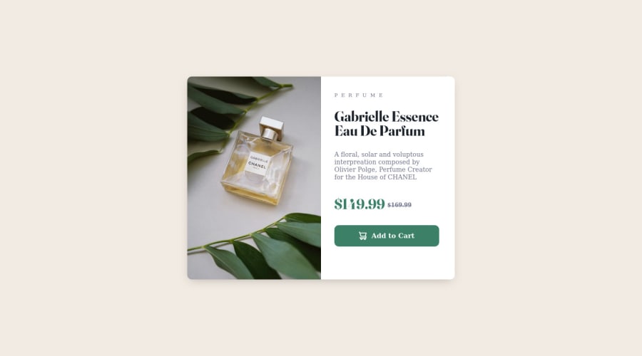
Design comparison
SolutionDesign
Solution retrospective
My Solution
Please log in to post a comment
Log in with GitHubCommunity feedback
- @iamenochlee
its the given font, applying border-radius to the frame alone saved me from extra work, also reduced my lines of code, thanks.
- @fatlindshehu
Hi @iamenochlee
Your Product Preview Card looks great, there are some tiny details that I would recommend checking:
- The font on
PERFUMEand on thebuttonis incorrect, check the files provided by Frontend Mentor to see the correct font! - You can set the
border-radiusonly on.frameand thenoverflow: hiddento show the rounded corners in the image alse, and you don't need to set theborder-radiusin the image too!
Keep up the good work!
- The font on
Join our Discord community
Join thousands of Frontend Mentor community members taking the challenges, sharing resources, helping each other, and chatting about all things front-end!
Join our Discord
