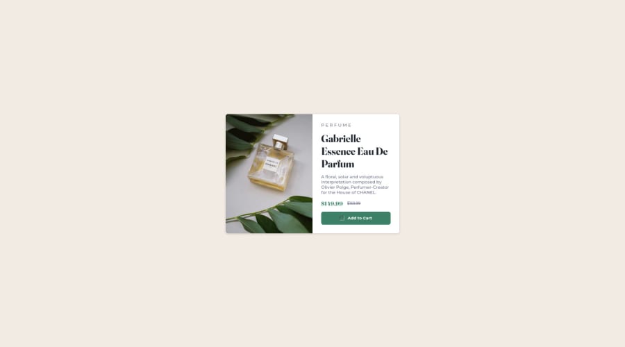
Design comparison
Community feedback
- @correlucasPosted over 2 years ago
👾 Hello Nel, congratulations for your solution!
Your component seems pretty good, there's only some fixes about the component size, it's too small, use at least
width: 900px;for the whole container. This way each column will have450px. Note that you can ever check thestarter filesand compare your solution to fix these layout issues..card { flex-direction: row; justify-content: unset; align-items: unset; width: 900px; }To manage the background, is better you apply
min-height: 100vh;to the body and align the body/container withdisplay: flex;.Doing these changes your solution will be almost perfect, you already set it as responsive, the colors and the devices version are yet fine.
Hope it helps Nel, happy coding!
Marked as helpful0@nelpopuliPosted over 2 years ago@correlucas 𝗛𝗶 𝗟𝘂𝗰𝗮𝘀, thank you so much for the tips. I don't have an access to sketch and Figma design files so I'm having a hard time setting about the sizes. Again, thank you, I'm gonna apply those tips later . ❤️
0
Please log in to post a comment
Log in with GitHubJoin our Discord community
Join thousands of Frontend Mentor community members taking the challenges, sharing resources, helping each other, and chatting about all things front-end!
Join our Discord
